

gorodenkoff
Tuesday’s June M2 release brought more good news: the M2 money supply in June was lower than its May level, and M2 has only increased at a very slow 1.7% annualized rate in the past six months. This all but ensures that inflation pressures have most likely peaked and year-over-year inflation will be falling by the end of this year, if not sooner. Slow money growth also is good news for the economy, since it means the Fed will not need to tighten nearly as much as the market seems to fear—and that, in turn, dramatically reduces the risk of a near-term recession.
The current episode of Fed tightening that we are living through is fundamentally different from all the others. Why? Because the excess money creation that fueled the surge in inflation over the past year was a one-off event that was tied directly to the trillions of dollars of fiscal “stimulus” that politicians pumped into the economy in the wake of the Covid lockdowns. As I remarked her two years ago, “The shutdown of the US economy will prove to be the most expensive self-inflicted injury in the history of mankind.” And indeed, it has been proven thus. Not only was it futile—respiratory viruses cannot be contained by any known means, and masks are not only useless but unhealthy, especially for children—it was extraordinarily expensive since it thoroughly disrupted the world’s major economy and was indirectly responsible for a worldwide surge in inflation whose consequences will be felt for many more months to come.
The Fed was guilty of tolerating a huge expansion in the money supply for too long, but Fed policy did not create it; massive fiscal deficits did. And since those deficits have all but disappeared, the money supply is coming back to earth. Monetary conditions have effectively tightened with only modest increases in interest rates.
In the past, the Fed tightened monetary policy by reducing the supply of reserves to the banking system. By making money scarce, the price of money rose (i.e., interest rates rose). Higher interest rates tend to slow the growth of money and slow the pace of inflation, but a forced scarcity of money typically led to myriad pernicious effects. It shuts off the flow of credit to businesses and households, ultimately resulting in bankruptcies and a collapse in the housing market.
Today’s “tightening” features only higher interest rates. Monetary liquidity is still abundant, and credit spreads (leading indicators of bankruptcies) are only moderately elevated. A doubling of mortgage rates was almost immediately accompanied by a cooling of the housing market; those looking to buy a house found that the cost of doing so was suddenly much more than they could afford, so they pulled back and prices in many areas have subsided. Banks didn’t stop lending so much as people stopped borrowing.
Chart #1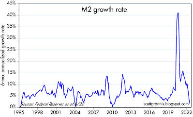
Chart #1 shows the 6-mo. annualized growth rate of M2. The massive money-printing episode which gave us 10% inflation is now history. The Fed didn’t have to do much if anything in the way of tightening to get this result since it was mainly the fault of politicians who showered the economy with money.
Chart #2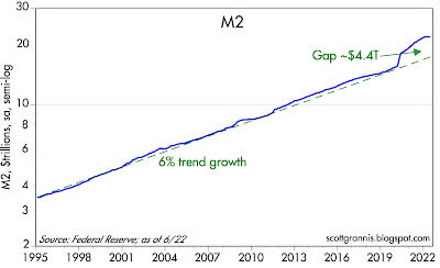
Chart #2 shows the level of M2 relative to its long-term trend growth rate of 6% per year. The gap between the two has narrowed this year and will continue to do so.
Chart #3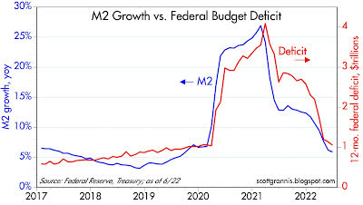
Chart #3 compares the year-over-year growth of M2 to the level of the federal budget deficit. It’s overwhelmingly obvious that the deficit was the source of the surge in M2. But the deficit in the past 12 months has subsided to a “mere” $1.05 trillion, down dramatically from a peak of over $4 trillion. The money you received in stimulus checks in 2020 and 2021 was hot off the printing press, and that is why we have so much inflation today. Thank goodness it’s now a thing of the past.
Chart #4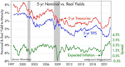
The bond market has figured this out, fortunately. As Chart #4 shows, the market expects CPI inflation to average about 2.5% per year over the next five years. The Fed doesn’t have to do much more, since a solution to our inflation problem is already baked in the cake, so to speak.
Chart #5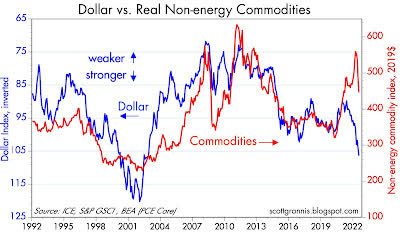
The commodity markets have reacted as well to the changing monetary conditions. Virtually every commodity has fallen significantly from its recent peak. Meanwhile, the dollar has been strong throughout, which implies that the US economy is in fundamentally good shape, especially compared to other economies.
Chart #6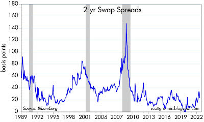
Chart #6 is critically important since it shows that liquidity conditions (as measured by 2-yr swap spreads, which currently trade at the very reasonable level of 23 bps) in the US economy are excellent. There is no shortage of money; markets are liquid, and that is almost a guarantee that we are not staring into any abyss these days. The Fed hasn’t really tightened at all, and the banking systems are functioning normally. The economy is working off the excess of M2 in a healthy, non-threatening fashion.
Chart #7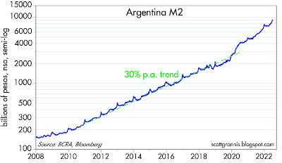
I can’t resist featuring a few charts from Argentina, a country I have known and followed closely for the past 50 years. Argentina is where I first learned about how inflation works. Click here for a synopsis. Argentina has had a long and tragic history of high inflation, and it couldn’t get much worse than it has been in recent years. As Chart #7 shows, Argentina’s money supply grew at a 30% annual rate from 2010 through 2020; since then, it has grown even faster—in the past 12 months, in fact, it has surged by almost 70%!
Years and years of money printing has given Argentina a lifetime of high inflation episodes of what might be termed hyper-inflation. (I was there to witness a bout of hyperinflation, in which prices doubled in the span of three weeks.)
Chart #8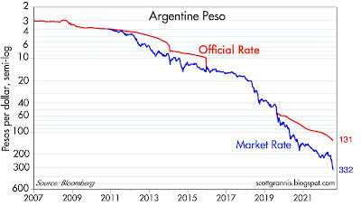
Not surprisingly, all that money printing has destroyed the value of the peso. As Chart #8 shows, the Argentine peso has lost fully 99% of its value vis a vis dollar since early 2007. The black market exchange rate (aka the “blue” rate) has collapsed to well over 300, far below the official rate of 130. This can’t go on much longer, but I wish I knew what comes next. I would certainly agree with Steve Hanke that Argentina’s only salvation is to dollarize its economy, but that is unlikely since it would mean that politicians would have to balance the budget in an honest fashion. But who knows, desperate times usually result in desperate measures.
In any event, it’s greatly comforting to see that the US money supply grew at a 30% rate only briefly, and the US dollar remains one of the world’s strongest currencies.
Editor’s Note: The summary bullets for this article were chosen by Seeking Alpha editors.
Be the first to comment