

Ibrahim Akcengiz
Inflation pressures are in fact cooling contrary to what you are hearing in the press, which loves to sensationalize things.
There is abundant evidence that inflation pressures are cooling: Non-energy commodity prices are soft (see my last post for lots of charts). Oil is down over 25% in the past four months. The dollar is very strong.
Inflation expectations are relatively low and stable (averaging about 2.6% for the past 2 ½ months). Housing prices and new mortgage applications are falling because mortgage rates have doubled so far this year (this means Fed rate hikes are getting lots of traction). Rents are still on the rise, but they are a lagging indicator (rents rise about a year after prices rise, so they will likely begin to stabilize about 6-9 months from now, because prices started falling a few months ago).
Yes, on a year over year basis, it looks like consumer price inflation is still on the rise. But on a 6-month annualized basis, which is best for picking up changes on the margin, inflation is falling.
Above all, I can’t emphasize enough that this inflation flare-up was not caused by a Fed policy error: it was caused by the federal government’s attempt to soften the blow of Covid lockdowns with massive, deficit-financed transfer payments that inflated the money supply. That mistake ended over a year ago, and M2 money supply growth has since decelerated significantly. So, the fundamental reason for our current inflation has long since begun to fade in importance.
I’ve been saying for months now that inflation pressures have peaked, and I still think that’s the case. But I’ve also said that inflation would remain uncomfortably high, probably through year-end, because of all the inflation “in the pipeline” which takes a while to work through the economy. So, we need to be patient.
What this means is that the Fed is not going to have to tighten much more than it already has. A 75 bps hike at next week’s FOMC meeting might be enough. That in turn implies that the market is overly concerned about the downside risks to the economy. This is no time to panic. Are you listening, Chairman Powell?
Chart #1

Chart #1 is an update of a chart I featured some months ago. It is critically important because it shows that the huge increase in the M2 money supply coincided exactly with a huge increase in the federal budget deficit, which in turn was caused by multiple trillions of dollars of Covid-related transfer payments. This is no longer happening.
Chart #2
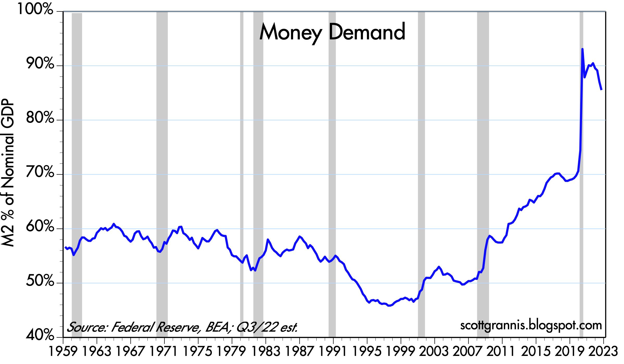
As Chart #2 shows, the problem all this extra money created (inflation) is resolving itself as people spend down their extra (unwanted) money balances. Crushing the economy with tight money now is not the solution. What the Fed needs to do is to simply raise rates by enough to slow the decline in the demand for money. They have already done that, as evidenced by all the market prices that are softening everywhere.
Higher interest rates work directly to increase the demand for money (and by inference to decrease the demand for borrowed money). This is the way monetary policy works in an era like today, which began in late 2009 when the Fed decided to pay interest on bank reserves. Before, the Fed had to raise interest rates indirectly by creating a scarcity of bank reserves, and while that worked to increase the demand for money it also created a shortage of liquidity, which can have many collateral and damaging effects in the financial markets.
If money balances (represented in the chart by the ratio of M2 to nominal GDP) don’t decline dramatically, the economy can gradually absorb extra money as inflation declines moderately. And along the way, sudden attacks of panic like we saw yesterday work to increase the demand for money, thus minimizing the inflationary potential of extra M2.
Chart #3

Chart #3 compares the 6-month annualized change in the CPI vs the 6-month annualized change in the Core CPI (ex-food and energy) through last month. By this measure, inflation in both series has peaked.
Chart #4

Chart #4 compares the 6-month annualized change in the CPI and the ex-energy version of the CPI. Energy prices are by far the most volatile component of the CPI, so using this version helps see through the noise. Again, by either measure inflation looks to have peaked a few months ago.
Chart #5

Chart #5 shows the 6-month annualized change in the Producer Price Index vs the Core version of the same. Here again it looks like inflation has peaked. This is significant, because producer prices capture inflation earlier in the pipeline than the CPI. The same story is playing out in the commodity markets, where prices have been declining for months; sooner or later those declines will be passed through to the consumer in the form of more stable and possibly lower prices.
Chart #6

Chart #6 shows the level of real and nominal 5-yr Treasury yields and the difference between the two, which is the bond market’s expectation for what the CPI will average over the next 5 years. I note also that the blue line (the real yield on 5-yr TIPS, currently about 1%) is a proxy for the average inflation-adjusted level of the Fed funds rate over the next 5 years. We haven’t seen such a high level for a long time.
Real yields were much higher in the late 1990s and through much of the 2000s, but that was because the economy was a lot stronger than it is today – a sustained, high level of real yields requires a sustained, high level of real growth. It’s tough to see real yields moving much higher than they are today given all the headwinds the economy currently faces: rising tax and regulatory burdens, expensive energy, geopolitical turmoil, and uncomfortably high inflation.
Of course, if the Fed were to aggressively tighten by pushing real yields to, say 2%, then that would likely cause a recession. Recall that all recessions in the past 50 years or so have been preceded by very high real interest rates which were the direct result of Fed tightening actions. Very high real yields accompanied by an inverted yield curve and very high credit spreads are the basic ingredients for a recession. Today we only have one of those ingredients present: an inverted yield curve. That’s why I’m reluctant to say that the economy is in a recession.
Chart #7

Meanwhile, 2-yr Swap Spreads remain my go-to guide for how much the economy is suffering as a result of stresses in the financial markets. As Chart #7 shows, these spreads are somewhat elevated, but not nearly as much as we have seen in past episodes of great financial and economic stress. Note how swap spreads tend to rise in advance of recessions and in advance of recoveries; they are great leading indicators. In a “normal” world, you would expect to see swap spreads range between 10 and 30 bps. (See my swap spread primer for more background.)
Editor’s Note: The summary bullets for this article were chosen by Seeking Alpha editors.
Be the first to comment