

shaunl
Recap: The Unwinding of a 40-Year Disinflationary Cycle
Today’s discussion is about future news and past news as regards the inflation that investors still don’t realize they face. Current news? That’s the least helpful; it only means you’re consuming the same information in the same opinion fog as everyone else, and that you’re subject to the same valuations and future returns they’ve already established.
In current news: the investment industry and public now accept that there is inflation. They now discuss and wish to know how to invest for it.
Future news: the public discussion still suggests that investors in the future might discover that they didn’t know the critical questions to ask. Two years from now, or five or ten, which questions will you wish you knew to have asked? For instance:
- Invest for how long? Maybe you invest differently for a 1- or 2-decade structural inflation than for a 1- or 2-year cyclical inflation.
- Invest for what kind of inflation? Hard-commodity-based price pressure, or monetary-driven currency debasement? Or both? Or other types of supply-constraint inflation? The answer might determine which instruments or sectors and strategies to pursue.
- What not to invest in. Continue to hold mega-cap IT companies, because they seem cheaper now? Bonds, because they seem cheaper now? Have those valuation corrections run their course, or have they only begun?
These latter questions are better answered by reference to past news, historical norms. The tricky part about the concept of historical norms is that the professional and academic investment community still presumes that the last 2 to 4 decades are the normative frame of reference. We’ve previously reviewed why they are actually the anomaly.
Anomalous as to the conditions that created the historically extreme corporate profit margins. Anomalous as to 40 years of declining interest rates that supported extreme stock and bond valuations, and which enabled governments to finance spending levels in excess of tax revenues, and otherwise unsupportable levels of debt.
If we’re talking about a transition to a structurally different economy – which we are – there are ways of thinking about how to invest for that eventuality.
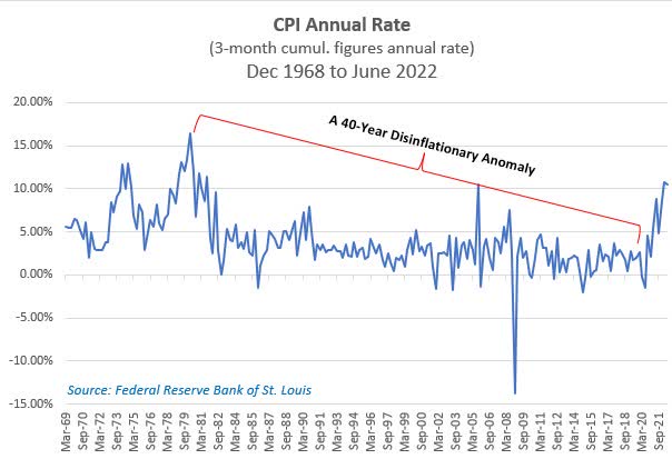
A few months ago, we issued an additional, supplementary Quarterly Review because inflationary pressures had suddenly broken irrefutably into popular statistics like the CPI, into the bread-and-butter price levels of housing, food, and fuel, and into the authoritative realm of Federal Reserve interest rate policy statements. That supplement was a backward-looking compare-and-contrast of today with the inflationary 1970s, because that decade is the reference point to which the public discussion had turned.
Unfortunately, the damaging 1970s and the subsequent recovery period is a misleading reference point. This is part of the understand-the-past in order to inform-the-future discussion, like my mother’s admonitions about why I should take an interest in history, an argument that failed to persuade me at the time. Unfortunately, the investment industry is largely devoid of anyone with experience investing in an inflationary environment, since that crowd is now either retired or retiring.
To briefly reprise, one essential difference between the 1970s and today is as follows:
- By the end of that period, in 1979, the federal debt/GDP level was only about 31% and had actually declined during the decade. Today the ratio is about 130%, already beyond all historical experience, and probably still rising.
- In 1980, total public and private U.S. debt was 178% of GDP, and cost an average 13.6%. Within 11 months, interest rates would begin a 40-year decline, so that risk was about to peak. Today, total U.S. debt is 489% of GDP, at an average interest rate of only 3.72%, while the average rate on the Federal debt is only about 1.43%. Just this year, though, the 5-Year Treasury rose to 3%, from an average 1.6% over the past five years. And 1-year Treasuries also rose to 3%, from less than 0.1% a year ago. The relevance of those increases is that, crudely estimated, somewhere between 20% to 35% of the marketable federal debt comes due within the next year, and a similar proportion within 1 – 5 years. That’s well over half of the Federal debt to be replaced at higher rates in the near to intermediate future. So?
Maturity Distribution of U.S. Treasuries Held by the Federal Reserve, Jan 2020 to July 2022
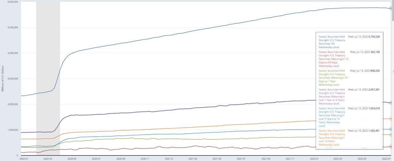
Release Tables: Maturity Distribution of Securities, Loans, and Selected Other Assets and Liabilities
- Just to casually stress-test the implication, a 3%-point increase in interest rates in 1980, would have raised the interest expense burden of the economy – a no-loop-hole tax hike on businesses and individuals – by 5.3% of GDP. That’s the equivalent of a severe recession, but the government’s balance sheet would have allowed for increased borrowing and spending for economic support. Today, a 3%-point increase in interest rates would result in an interest expense ‘tax’ – effectively, a reduction of GDP – of 11%(!). That’s about the same impact as the disastrous pandemic economic disruption of early 2020. Moreover, the government’s leveraged balance sheet now imposes far greater constraints on its ability to support the economy in a moment of extremis, just when social obligations would rise.
Merely on the debt leverage and government deficit fronts, today’s circumstance is certainly very different than the 1970s.
But there are many other important differences. For the past couple of years, our discussions have focused on two central inflationary mechanisms:
the national debt leverage and associated excess money supply growth, and - the decade-long global decline in capital spending on hard commodity reserves replacement, primarily oil, although other critical commodities like copper have been covered, too.
Why only focus on debt leverage, money supply and oil reserves insufficiency? Because you have to start somewhere. And because when any topic is so far outside the public opinion as to appear far-fetched (like inflation), you might have to start somewhere obvious.
Now that the reality of an inflationary environment is widely accepted, we can move on to additional structural contributors to inflation that will impact future news and inform today’s investment choices. The investment environment remains just as dangerous, we’re still bestride a historical-scale inflection point, and the broad investment discussion still remains behind that recognition curve.
Other Supply Limitations
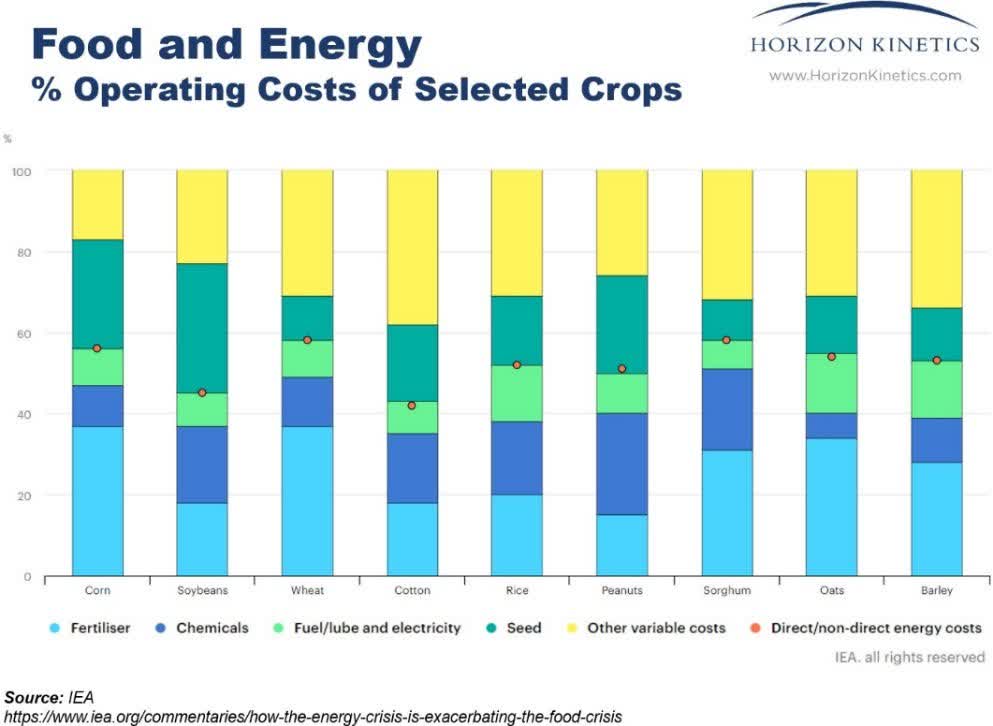
Let’s stick with energy for a moment, but in a different way than we’ve covered before. We already know that oil is the keystone commodity: even other commodities, whether copper or food crops, can’t be extracted or created without it. For example, energy comprises about 50% of the operating cost of common crops like wheat, soybeans and cotton. The largest component of that 50% is fertilizer, much of which is derived from natural gas. The next largest might be herbicides, feedstocks for which come from refineries.
Here’s a surprising idea: U.S. businesses and consumers consume virtually no petroleum. They really don’t. To repeat, in terms of end use, the U.S. doesn’t use any oil at all.
What we do consume are the various components of oil, the fuels and other hydrocarbons that must be separated out from it, like gasoline, jet fuel and asphalt. And there are the gas liquids like propane, and natural gas, which is primarily methane. Some of these gas liquids, like ethane, or other refinery products like ethylene, are the feedstocks required to produce the thousands of end components embedded in everything found in a modern economy, from plastics to adhesives, paints, and textiles like polyester. Even the primary feedstocks are mostly used to produce secondary feedstocks, like ammonia and formaldehyde.
The separation of those fractions and some further processing is done in a refinery. In that sense, the U.S. can have all the oil and gas it wants, can be overflowing with it, but that oil would be useless without the refinery capacity to fractionate it – as in the quote from Coleridge’s The Rime of the Ancient Mariner, becalmed at sea: “Water, water, everywhere, nor any drop to drink.”
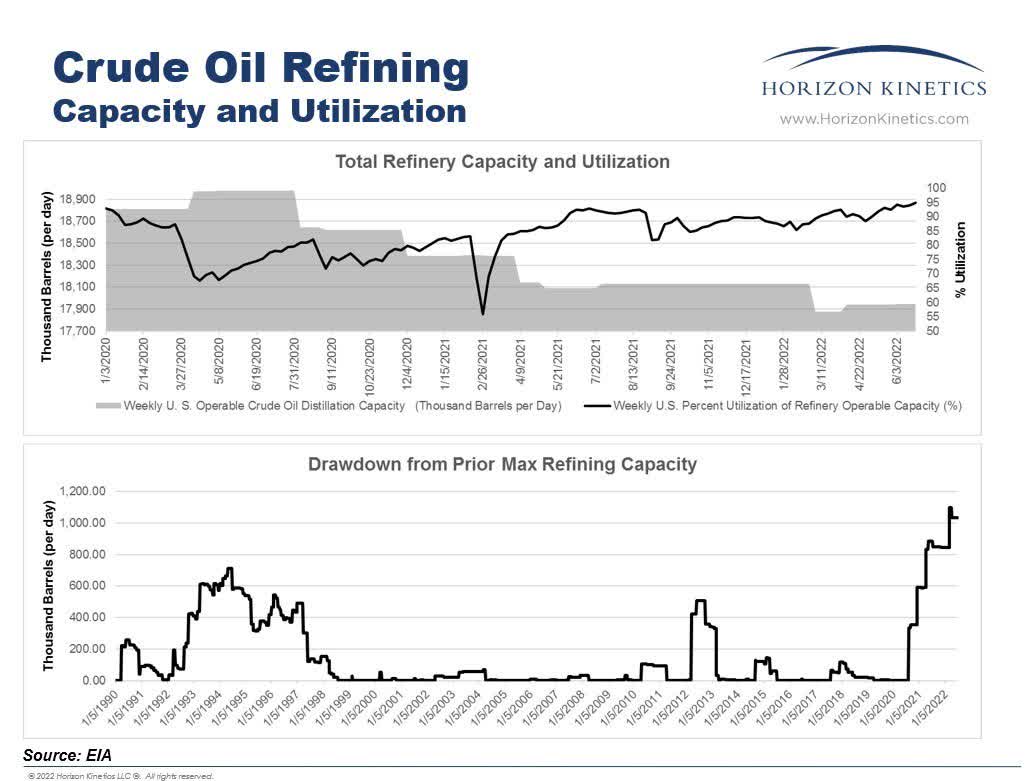
Refinery Capacity Limitations
Unfortunately, refinery capacity is another structural inflationary supply constraint we face. While the U.S. refining industry is the world’s largest, with 128 facilities, there were 135 at the start of 2020, and 324 in 1981. The capacity figures (as opposed to the number of refineries) are not as stark: at year-end 1984, refineries operated at only 74% of capacity in aggregate, while they now operate at a 90% utilization rate[1]. The higher utilization offset much of the plant closures. Also, existing refineries benefit from efficiency and capacity improvements, which has probably added 1% per year or so to the aggregate figure.
Nevertheless, the U.S. has lost 1 million barrels/day of capacity since the beginning of 2020, which is a 5.4% reduction, though not all of it is permanent. Some are being dismantled, and some facilities are being repurposed, such as for biofuels production. Five percent in a couple of years is a major supply reduction for a critical commodity. That’s short-term.
More importantly, since 1984, refining capacity has increased by only 15% while domestic oil consumption rose by 29%. This is the problem. Nor is it just a domestic phenomenon. Globally, about 3 million barrels/day have been lost since 2020. Two of Australia’s four refineries have closed in the past couple of years.
Here’s an interesting data point relative to the U.S. refining industry: in May, the Australian government agreed to pay the two remaining refineries up to $1.8 billion through 2030, to keep the plants open and for upgrades to produce cleaner fuel. The two plants have a combined capacity of only 237,000 barrels/day. The last major refinery built in the U.S., quite some time ago – more of which below – has a capacity of 585,000 barrels/day.
Why not just build more? Refining is highly capital-intensive, with notoriously deep and volatile profit/loss cycles, and has been subject to increasing political, regulatory and financing constraints. This will sound familiar from prior discussions about the reserves-replacement challenges for oil or copper, only it’s far, far worse. It would be exceedingly difficult, even for a party actually interested in building a sizable refinery, to secure suitable land, the zoning and regulatory approvals, financing, and even equipment.
A new project, even assuming, for the purposes of discussion, receipt of the eventual allowances, could take a decade to build. In other words, who would want to build and, if they did, who would want to lend or provide capital?
From a return on invested capital perspective, it is a most unattractive industry. How unattractive? The newest refinery with sizable downstream capacity was built in 1977 – 45 years ago. Here’s a synopsis from a highly informed party. This is an industry insider with a known vantage point, so one should take his utterances with that awareness – or wariness – but perhaps informative nonetheless:
“We haven’t had a refinery built in the United States since the 1970s,” [Chevron, CVX] Chief Executive Officer Mike Wirth said in an interview on Bloomberg TV. “My personal view is there will never be another new refinery built in the United States…You’re looking at committing capital 10 years out, that will need decades to offer a return for shareholders, in a policy environment where governments around the world are saying: we don’t want these products…We’re receiving mixed signals in these policy discussions.”[2]
The End of the Exporting-Inflation Era
Qualitative vs. econometric analysis
How to explain the “great disinflationary period”? In the 39 years between 1980 and 2019, the Consumer Price Index rose at a 2.85% annual rate even as the U.S. money supply expanded nearly ten-fold3— a 5.97% rate. In the final 10 years to December 2019, the money supply growth rate was even higher, 6.07%, while Federal debt rose at a 7.34% rate[3]. This predates the extraordinary money supply increase that commenced in early 2020 to support the economy during the COVID-19 pandemic.
How could inflation remain so low during decades of excess money supply growth and rising debt leverage, a period that included the two longest stretches of uninterrupted economic growth in American history?[4] Because of a few contributory reasons that we’ll touch on below. Those reasons have run their course, can’t be repeated, and were external to any policy decisions by the Federal Reserve.
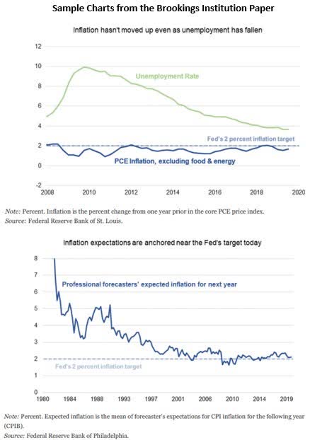
First, one should appreciate that these forces are not part of the general discussion in the institutional investment world or among policy makers. Many of the theories put forth by academic and economic policy organizations about this phenomenon were reviewed in a January 2020 paper by the Brookings Institution.[5]
These included a discussion by former Federal Reserve Board chair Janet Yellen about the changing slope and responsiveness of the Phillips Curve, which she termed the “workhorse model of inflation…used by most economists, including Federal Reserve staff.” The Phillips Curve links current inflation figures to labor market conditions and related factors.
Also considered in this paper was the changing curve of inflation expectations by professional forecasters. It was felt that such expectations had become more anchored to the Fed’s lower-inflation policy target. Former Fed Chair Ben Bernanke was referenced as “arguing that central banks’ focus on anchoring expectations has been the ‘most important factor over the long haul’ in the behavior of price inflation.”
A Harvard Business School professor found that the incorporation of technology, like “the advent of online retail and sophisticated pricing algorithms” permitted retailers to engage in more frequent and consistent pricing changes amid better market information, perhaps eroding the relationship between prior statistical methodologies and the Phillips Curve.
In 2005, then Federal Reserve Chair Alan Greenspan also attributed the prior decade of low inflation amidst economic growth to “the remarkable confluence of innovations that spawned new computer, telecommunication, and networking technologies, which…elevated the growth of productivity, suppressed unit labor costs.”[6]
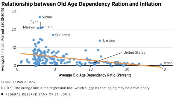
A similar paper by the Federal Reserve Bank of St. Louis in 2018 considered the relationship between aging populations in different nations and lower inflation, using an Old Age Dependency Ratio8. The authors noted that, variously, the International Monetary Fund, Janet Yellen and Federal Reserve Vice Chair Donald Kohn found that the impact of globalization on inflation, while “at least debatable,” was “small in the industrial economies” and that “the impact of foreign factors on U.S. prices is rather limited.”
Most of these theories are by and for econometricians – using quantitative and statistical techniques to verify or confirm a theoretical economic model. They are rooted in such data and data modeling and can be very sophisticated. Assertions and models must be rigorously proven and reviewed.
We here ‘on the streets’ of investing work under no such formalities or strictures. Here are some different kinds of observations.
The End of the Global Raw Materials Arbitrage
Many are impressed by the Federal Reserve’s recent 0.75% rate increase. Yet, it is arguable that even the 10%-point Fed Funds rate hike by Paul Volcker in the final months of 1980, to over 19%, would not have controlled inflation had it not been for the good fortune of seminal events in other countries’ economies.
Around 1981, a decade prior to its formal collapse, the Soviet Union faced grave economic difficulties. There were shortages of wheat, machinery, and technology equipment. Those had to be imported, which required payment. The only way to obtain hard currency was to sell the only resource the Soviet Union really had that the Western world wanted: commodities.
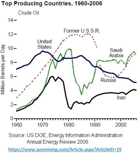
Suddenly, and at a time of accelerating global inflation – oil was $140 in 1980, and gold over $2,500 – the Soviet Union began to dump every kind of commodity on the world market, from oil, copper and gold to diamonds. It became the world’s largest energy producer[7], and by 1988, Soviet oil exports reached 5.3 million barrels/day even as production elsewhere declined[8]. Canada still doesn’t export as much as that, and the U.S. only surpassed that figure in 2017.
When the Soviet Union did formally collapse in 1991, there continued to be very little restraint. As far as economic cycles go, the entrance of the Soviets basically broke the back of commodity inflation and initiated a 40-year depression in commodities, albeit interrupted by occasional interim recoveries.
Another commodity-based counter-inflationary factor was the vast increase in global oil reserves during the 1980 to 2010 period. Global oil reserves more than doubled in the 30 years between 1980 and 2010. That was annualized expansion of 2.76%. Then things slowed.
The increase between 2010 and 2020 was only 0.6% per year. And much of that minimal amount was due to the outsized contributions – a doubling of production – of Canada and the U.S. In the U.S., the increases were care of the deployment of water injection technology (fracking). The problem is that this North American production success is not sustainable; it has run its course.
| Global Crude Oil Reserves | Billions of Barrels | Annlz’d Increase |
|
1980 |
643.99 |
|
|
2010 |
1,459.18 |
2.76% |
|
2020 |
1,548.65 |
0.6% |
Source: opec.org
The U.S. also came to rely on importing commodities and commodity-based partly finished goods that, although they could be produced domestically, were problematic in ways that weren’t in less developed nations. One example is polysilicon, the high-purity form of silicon used to produce solar panels. It is a highly polluting process with very toxic byproducts. China, for reasons ranging from the cost of and regulations around labor, land, energy (like coal), and other environmental and recycling requirements, could produce solar panels far more cheaply.
China now supplies some 80% of the world’s polysilicon. To the degree that the production of this or other commodities begins to shift back to the U.S. or other developed economies (more of which in a moment), whether for political or national security reasons, then that is disinflationary geographic commodity price arbitrage that goes away.
The 40-Year Global Labor & Manufacturing Arbitrage
As just alluded to, another counter-inflationary force during the past 40 years was the sourcing of inexpensive goods from foreign low-cost labor markets. Although Chinese communism was not collapsing as was the Soviet Union, it was under stress. China is not really a commodity-rich nation, so it could not emulate the Soviet Union’s solution.
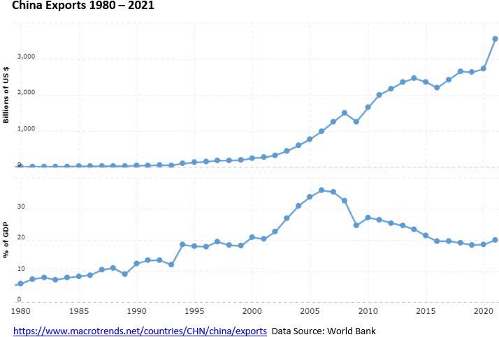
However, it did have one billion people, and this low-cost labor force was what China put on the global market. This enabled the U.S., Canadian and European nations to export their high labor costs – by transferring manufacturing – to China, essentially an offshore labor arbitrage. Once China did that, it created a model for imitators, like India, Vietnam, Thailand, the Philippines, South Korea, Brazil, and Mexico.
The magnitude is remarkable. China’s exports expanded 240-fold between 1980 and 2020, a 14.7% growth rate, from a mere $11 billion to $2.72 trillion. That’s pretty much the GDP of the United Kingdom; only four countries have larger GDP than China’s exports.
That was quite a benefit. But such a growth rate can’t be maintained indefinitely. Indeed, the export growth rate in the final 10 years to 2020 was only 5.1%.
India is the other great pool of labor. Its 40 year export growth rate was 9.9%. The latest 10-year growth rate was 2.9%. If we want to give the benefit of the doubt for possible 2020 pandemic effects, the 9-year growth rate to 2019 was 3.9%.
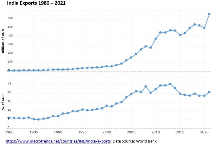
The large low-cost labor exporters are still growing, if one ignores the pandemic impact, but growth has been gradually slowing. The immense export growth from low-wage nations over the 40 years from 1980 to 2020 was a massive and unique counter inflationary trend: a couple of billion people suddenly entering the global labor market. That force has more or less exhausted itself.
The U.S. is, in principle, self-sufficient in many natural resources and manufacturing. It’s just that it will cost more.
Port Capacity Limitations
The global manufacturing/labor cost arbitrage had follow-on effects that are also structurally inflationary. This relates to the importation of that massive volume of off-shored manufacturing. To set the stage, let’s begin with something that is not particularly problematic: the U.S. interior transportation network. A visualization that our CIO Murray Stahl uses is to imagine a map of the United States.
Then imagine, superimposed on that map, a map of the railroad network. And then another map superimposed on that: the roadway network. And continue in that way with the river transport network, the coastal transport network (e.g., New Orleans to New York City), and air transportation routes, and even the oil and natural gas pipelines.
One will see how dense the U.S. transportation network really is. If a problem arises with one node of the transportation network for whatever reason, such as a weather-related issue that blocks an airport or railroad line, it is always possible to bypass it.
However, that redundancy doesn’t exist for imported goods. Something like 99% of overseas trade passes though the nation’s ports. One-third of all U.S. import-related seaborne traffic comes through two ports: Long Beach and Los Angeles. Add Newark, and the top three ports account for about one-half of inbound volume.
Clearly, there is a limit to how much volume those ports can handle. Reasonable minds can differ about what that number is, but only so many berths can exist in a harbor. Beyond that, a transportation problem arises. It is not possible to divert traffic, because the port network is a bottleneck that cannot be easily replaced.
That is a problem in cost-of-goods inflation. The evolution of a global supply chain, as opposed to a national supply chain, creates efficiencies but also vulnerabilities. In terms of efficiencies, international trade theory suggests that each nation will specialize in those products for which it has a competitive advantage. The consuming nations therefore have less expensive and better products than they would have if they produced all their own goods internally.
The vulnerability is that most international traffic in goods will rely heavily on the sea lanes. In order to obtain the comparative advantages of international commerce, the consuming nations must have adequate port capacity. A temporary problem at a given port, whether a port of embarkation or a port of destination, will obviously disrupt the supply chain. A structural problem is having an inadequate number of ports for the volumes required.
U.S. Oil Field Productivity: A New Supply/Price Limitation
Compared to one year ago, the change in daily oil and natural gas production is nothing remotely close to the marginal increase in rig counts. The oil rig count today is almost 60% higher than a year ago, but production volume is only 4% higher. Why?
Sources: Rig Counts as of 7/15/2022 (North America Rig Count | Baker Hughes Rig Count). Oil production as of April 2022. Natural Gas daily production as of 7/13/2022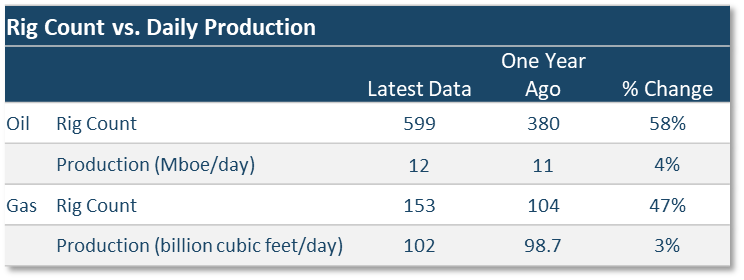
Continuing technological development in the past decade has enabled continually improved drilling of U.S. oil basins that were previously uneconomic, perhaps because of great depth or because the oil and gas was trapped within shale rock in narrow bands that did not provide sufficient volume using traditional vertical drilling methods. The great majority of new drilling is no longer the vertical bore – like a straw inserted into a sizable reservoir – which requires extensive up-front capital expenditure and relatively little spending thereafter.
Most oil and gas production today is via horizontal drilling that extracts smaller volumes from each ‘lateral’, which depletes relatively rapidly without further action, such as by drilling a new bore, or even extending the length or changing the angle of the lateral. This requires continued capital expenditure.
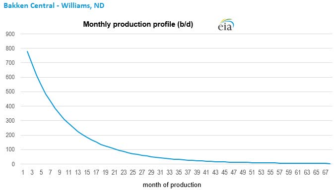
How rapidly does output decline? This production decline curve is calculated by the Energy Information Administration for Williams County in the Bakken play in North Dakota. It is based on actual well production data. These studies can incorporate wells with widely differing characteristics, so it is formulaically representative, but not precise as to any well or small sub-set of wells.
Nevertheless, it observes a 50% drop in production after the first 6 months of operation, almost a 75% decline by the end of the first year, and over 90% by year two. As extreme as this might seem, it is typical, and the same result will be found for shale drilling in other major fields like the Eagle Ford play in southcentral Texas or the Permian Basin in west Texas.
Like the previous factors discussed in this review, this phenomenon also has implications for an inflationary environment that are not generally discussed or understood. If, say, 20 years ago, oil producers failed to secure funding for new well development or failed to secure new or renewed drilling leases, the production results in the near term would have been little changed. The existing vertical wells would simply have kept producing. Today – glance again at the chart above – production will fall rapidly in the absence of continued new investment. Yet another structural inflationary pressure point.
“The Market” (and the fading Excess Corporate Profits formula)
We’ve been discussing seminal events that occur rarely and meaningfully change the course of history or global economics. In the case of labor, populations of billions suddenly entered the global workforce at wage rates a trifling fraction of the industrialized-nation clearing price. In the case of commodities, the slow collapse of a major government that needed hard currency and got it by flooding the world with hard commodities.
In the case of energy, a 30-year 125% expansion of global reserves vs. a 55% increase in the global population. These were massive disinflationary forces that held commodity prices down for 40 years. Those forces have more or less exhausted themselves. Today, we’re in a very different position.
The low-labor-cost economies are becoming technological competitors, and their growth rates are slowing.
They can no longer confer a comparable disinflationary impact on their customer economies as in decades past.
There is the counterreaction against globalization by the customer economies whose workforce populations feel disenfranchised by the offshored labor. This has increased political pressure in favor of trade protectionism. More reversal.
For good or ill, the ‘developed’ OECD world hasn’t spent the capital required to ensure it can produce sufficient quantities of the products and resources needed. Shortages manifest in higher prices.
A consequence of this macroeconomic disinflationary cycle was a 40-year financial asset inflation cycle. This enabled another seminal change: in the character of financial markets.
The 20-year rise of indexation. Indexation is based in part on the postulate of modern portfolio theory that a diversified portfolio is the answer to market risk, and that that risk can be determined by statistical analyses of prior price volatility. It is sophisticated, in its way, like econometrics. But, like econometrics, there’s little room for context and qualitative evaluation – divergent schools of thought.
The astounding success of the business of indexation – assets-under-management accumulation – partly relied on the impact of two decades of declining interest rates and declining security price volatility. These produced the successful back-tested volatility/return performance statistics that are prerequisite for launching a new ETF.
Then another 20 years for implementation. The emergence of, then the domination of the markets by, ETF investing took place under ideal conditions. What could go wrong in a world of decades of declining interest rates, declining volatility, rising corporate profit margins and rising valuations? Financial asset inflation was a rising tide that lifted all boats: bonds (high-grade, junk and global), stocks (domestic and international), the eventual equitization (via ETFs) of bonds and real estate and more.
Maximum diversification across every sort of index fund proved the proposition: high returns could be had with low risk. We’ll explore how that proposition is working out, in terms of portfolio risk in the new era. But first…
Here’s a rough working model, a rear window view, of the corporate profits formula for the era just past. We can be quantitative, too. This is separate from valuation inflation. It has not yet been submitted for peer review:
∑ LC + EL + DI +DC + Ice + Stir = Financial Assets Bull Market Martini (serving suggestion: ETF wrapper) Where:
LC = Lower Commodity costs = ↑ gross margins
EL = Export of Labor costs = ↑ operating margins
DI = Declining Interest rates = ↑ pre-tax margins
DC = Declining Corp tax rates = ↑ after-tax margins
Modern Portfolio Theory and Diversification: A New Thought
The Problem with Diversification (Never thought you’d hear that one, did you?[9])
Maximum diversification means minimal exposure to single-security risk. It also means maximum exposure to systemic risks. For example, no matter how many individual bonds you own, whatever the mix of corporates, tax-exempts and governments, all their prices will fall when interest rates rise. All their purchasing-power values fall continuously in the presence of inflation. None of this mattered during the anomalous historical period we’re discussing, because valuations were rising and the systemic risks were receding.
But what happens to a maximally diversified portfolio when those risks reappear? Interest rates, commodity price levels, tax rates, or a reversion to protectionism from globalization and free trade? The standard diversified portfolio is maximally exposed across the spectrum of risks.
How diversified are investors today? It’s an important question, because that has changed over time. The ETF phenomenon ultimately distorted not just the markets, but the composition of portfolios themselves, because with indexation – unlike active management – portfolios look like ‘the market’ or, more accurately, like the top tier of the market. That’s because the trillions of extremely active dollars flowing into indexed products meant that mainstream ETFs were pretty much restricted to those companies with global-scale, industrial-strength trading liquidity.
Modern indexation at scale would not have been possible were it not for the global, mega capitalization publicly traded companies. Over 20% of the assets in the largest in the five largest ETFs are in trillion-dollar or near trillion-dollar market cap companies. The five funds manage $1.3 trillion of assets. And despite the declines in the market in the first half of 2022, these ETFs received an additional $38 billion of net inflows.
Five Largest ETFs, Assets Under Management
| AUM ($ in bill) | ||
| SPY | SPDR S&P 500 ETF Trust | $349 |
| IVV | iShares Core S&P 500 ETF | 285 |
| VOO | Vanguard S&P 500 ETF | 252 |
| VTI | Vanguard Total Stock Mkt ETF | 250 |
| QQQ | Invesco QQQ Trust | 165 |
| $1,296 | ||
| Net inflows YTD through July 17th | $38 billion |
Source: etfdb.com, as of July 18, 2022
The easiest example of the trading liquidity requirements of the system is the SPDR S&P 500 ETF (SPY). Despite being called passive, the average turnover of the shares of this $350 billion fund is 11% per day, which is 27x per year.
Here is a sample of the most plain-vanilla standard portfolio allocation that might be recommended to someone. Vanguard was selected because it is a not-for-profit money manager owned by the unit-holders of its funds. It tries to practice basic, long-term indexation principles. On the introductory ETF page, the simplest suggestion is a combination of just four of the most basic asset-class indexes. For bonds, there is the Vanguard Total Bond Market ETF (BND) and the Total International Bond ETF (BNDX). For equities, the Vanguard Total Stock Market ETF (VTI) and the Total International Stock ETF (VXUS).
Together the two bond index funds have $370 billion of assets and an average maturity of 9 years. The two stock funds have $1.4 trillion of AUM[10]. I’ll take the chance and say that those numbers qualify this as a representative allocation for discussion purposes.
The median market cap of the companies in VTI, the U.S. stock fund, is $115 billion. Companies that large can hardly help but be exposed to the major systemic risks – they can’t occupy some idiosyncratic niche in the economy to escape systemic risks. As a class, they cannot grow at high rates for extended periods.
You want diversification? There are 10,123 bonds in the U.S. bond ETF, 6,680 in the international bond ETF, 4,098 companies in the U.S. stock ETF, and 7,843 in the international one. We’re talking 35,000 securities! And yet…not exactly that diversified.
Of the 4,000-plus stocks in VTI, a good estimate is that the top 200 or so[11], a mere 5% of all the holdings, account for about 70% of the market value of the fund. Nevertheless, 200 holdings should, arithmetically, be very diversified. The problem is that even the smallest of this subset, #200, has a $40 billion market cap. That is actually a very big company. Yet even #200 out of 4,000 is an irrelevance as far as the ETF’s performance, because it has a weighting of only 0.09% – hardly a rounding error[12].
Below #200, there are indeed thousands of smaller companies that could well have individualized or niche businesses that might be relatively unaffected – or even benefit from – the appearance of certain systemic risks. But they are largely in and below the 0.01% weighting category. There’s so much money in indexation, that not even a rounding error worth of investment can be made in them.
Therefore, VTI is a diversified index only of large and mega-cap companies. The international equity index is the same or more so. This kind of diversification will simply assure that most of such an allocation will decline under the reappearance of the risk-laden conditions that have been long absent until this year.
UNdiversification
How to get around that diversification problem, away from holdings that are more likely be impacted by systemic risks? One has to UNdiversify. Interestingly, that happens automatically if one tries to identify businesses and securities that are either specifically unaffected by these systemic risk factors or, better yet, might even benefit from them.
You would find that this is an exceedingly small subset of the conventional investment universe. You’re going to end up with a small fraction of the holdings of a broad index, and in many fewer industries. Most of them don’t even register within what institutional investors define as the investable universe.
Really, you create a form of what’s known as a completion index by doing this – a portfolio of what is missing from the standard index, everything that the standard index is not.
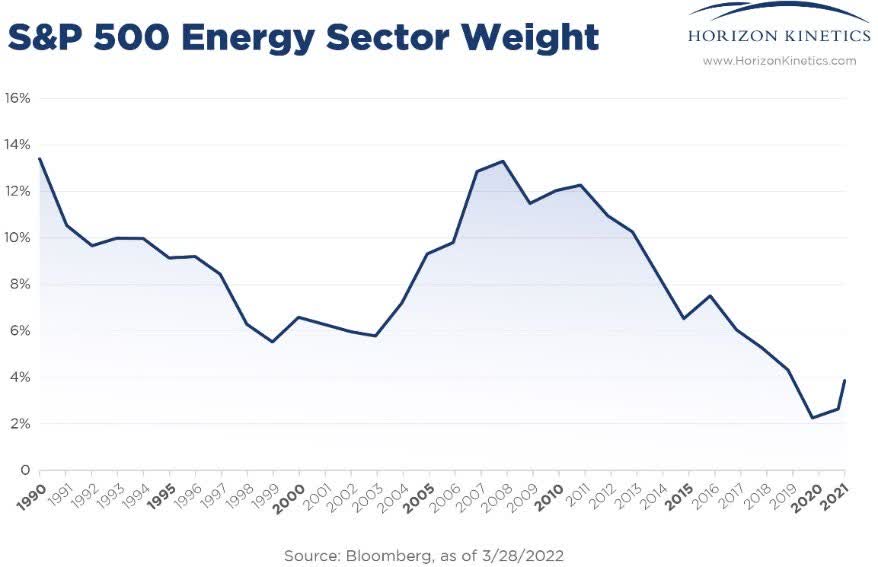
Even major industry sectors that are popularly thought to be inflation beneficiaries, like energy, have been largely or almost completely expunged from the indexes. The entire energy sector is now less than 4% of the S&P 500. Gold mining, represented in the S&P 500 exclusively by Newmont Corp. (NEM), with a $44 billion market cap, is only a 0.14% weight.
Unfortunately, those presumed inflation beneficiaries that do appear in the institutional investment universe, such as gold mining companies, actually do poorly in an extended inflation. That’s because they’re asset-intensive operating businesses subject both to capital investment cost inflation and operating cost inflation.
These burdens give way to profit margin contraction. Eventually, the mining companies are also subject to greater supply of the commodity they produce. If the price of gold climbs enough, more gold finds its way into the market, pushing the price down in the age-old cyclical fashion. Gold itself is more of a dollar-hedge alternative currency than an inflation hedge.
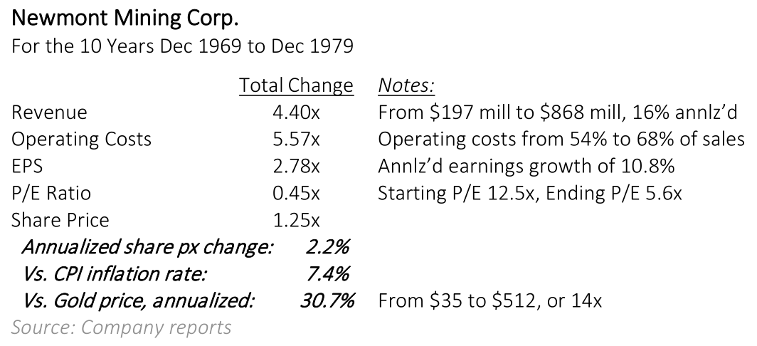
Here’s what happened to the price of gold in the 10 years 1969 to 1979: it went up over 14x, or 30.7% annualized. How did the class act in the gold mining business, Newmont Mining, do? So poorly that it lost substantial value on an inflation adjusted basis, and the stock price barely changed. Even though revenues rose by 16% a year. Some relevant figures are in the accompanying table.
Our portfolios have increasingly focused in recent years on businesses that can benefit from an extended inflationary environment. The diversification has necessarily narrowed, but in ways that we believe are risk reducing. Less exposed across the spectrum of the world’s business activities and systemic risks, more diversified across activities and assets that benefit from commodity inflation and monetary inflation, companies less subject to wage inflation.
Position sizes in these companies have been allowed to appreciate to be larger positions, in some cases quite large. All of this is at odds with institutional asset allocation and portfolio management practices.
One class of these investments is what we term tangible assets companies. These benefit directly from rising prices and production volumes of real assets like energy or minerals – meaning without intervening operations: no capital expenditures in land or machinery, no meaningful operating costs, or in some cases even any employees.
As discussed earlier, most investors’ consciousness is rooted in the past 40 years of the greatest environment for financial assets ever. People no longer think about, are not even aware of, the concept of tangible assets versus financial assets. Tangible assets had lousy returns, and there was no incentive to invest in them. Which is NOT the same as saying that asset-light tangible asset businesses, like royalty companies, did poorly.
Before reviewing some portfolio holdings, here is an example of what we’re talking about. This time, an 18-year period comparing gold and Newmont Mining, but adding a gold royalty company, Franco Nevada (FNV). Despite 18 years of declining gold prices, Franco Nevada shares appreciated at a high double-digit annualized rate, even though its business was based on receiving payments on gold produced at mines.
The reason it did so well on an absolute basis is that it simply took a share of revenues off the top. That’s simply a contractual arrangement, an unleveraged financing or discounting business. It’s a business that always generates cash flow and ROE, so it can compound financial value even when the underlying asset doesn’t appreciate.
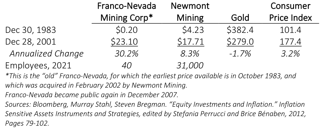
If this extraordinary example does not illuminate the essential difference between the inflation beneficiary model companies we speak of and the conventional business model approach, then I don’t know how to do better.
Some Portfolio Holdings[13]
The following were selected quasi randomly by looking at recent earnings and transaction announcements. There are some qualitative comments to make about each. In particular, one might notice how, as our CIO Murray Stahl is wont to say, “language corrupts thought.” On the one hand, in conventional industry sector terms and in terms of number of holdings, our portfolios might seem much more concentrated.
In a sense, they are. On the other hand, some of the selections below show how, in both a functional and qualitative sense, they are exposed in quite diverse ways – even more diversified than ‘the market’ – across many vectors of inflationary pressures, growth paths, and positive optionality events.
Wheaton Precious Metals (WPM)
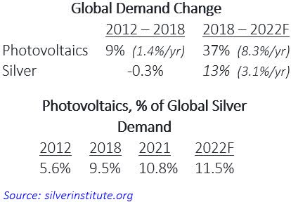
Even within the specific sector of royalty companies, there is room for value-added diversification. It’s not just about gold. Wheaton Precious metals, which has a $15 billion market value, provides the greatest exposure to silver, which accounts for almost half of its revenues. Unlike gold, a substantial portion of the demand for silver – about 50% – is for industrial use.
That’s long been the case, but there has been an important change, which is the demand for silver as a conductor for solar panels. Whatever the variety of projections for solar panel demand might be, it’s fair to say that this is a rapidly expanding industry. The company continually invests in new royalty/streaming contracts.
Solar panel demand for silver has grown to such a degree that it accounted for almost 60% of the total increase in global silver consumption in the past decade. It has become a significant factor in silver demand and might be the factor that tips the supply/demand balance into disequilibrium.
Altius Renewable Royalties Corp (OTCQX:ATRWF)
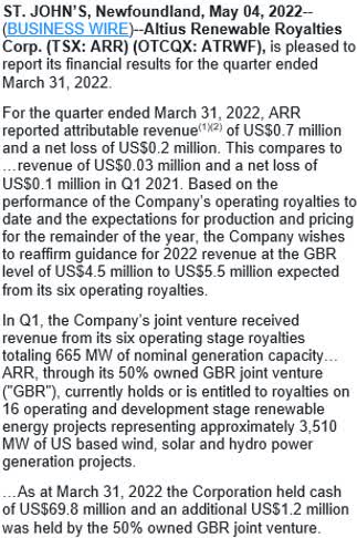
Altius Renewable Royalties has an entirely different focus: it buys royalty interests – a percentage of revenue off the top – for helping finance utility-scale solar and wind power installations. As for any royalty company, an essential element of its profitability model is that it is not necessary for the underlying projects to be particularly profitable, or profitable at all, merely that they continue to operate and produce revenues.
It is an early-stage company that just reported run-rate quarterly revenue of $2.8 million, and a quarterly loss of $0.2 million. It expects full-year 2022 revenue, though, of about $5 million, so it is expanding rapidly from a small base. The expected full-year revenue is from the six of its sixteen royalty interests that are now in commercial operation.
Altius Renewable is not a direct holding in our strategies. It is a publicly traded subsidiary of Altius Minerals, which owns 59%. Our preference is to hold the more established company, which brought Altius Renewable public in 2001 in order to achieve a reasonable valuation multiple on this business, which was given no meaningful value while buried within Altius Minerals.
Altius Minerals Corp. (OTCPK:ATUSF)
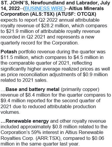
Altius Minerals provides exposure to a very different and important set of commodities than Wheaton Precious Metals or the gold royalty companies like Franco Nevada and Royal Gold (RGLD).
In the 1st quarter, 70% of revenues were from potash, the fertilizer, and base & battery metals, predominantly copper. It also has royalties on cobalt, nickel and zinc, among others.
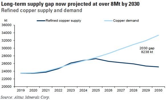
The company projects a dramatic global copper supply/ demand gap in the next half-dozen years. A gap that has yet to assert itself in disruptive pricing. Aside from demand for electrification projects (electric cars, renewable energy projects) and economic expansion, Altius attributes much of the gap to a decline in supply as many major mines are in the final stages of depletion.
The company writes that the average time from any new ore discovery to production is now 20 to 25 years, and that the capital expenditure required per pound of copper has escalated dramatically as the remaining ore grades in existing mines get poorer. These few statistics say volumes, if one is concerned about commodity-based inflationary pressures.
Here is a chart of the projected supply/demand gap for copper.
CME Group (CME)
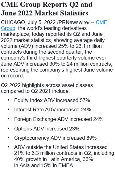
It’s been a volatile and almost exclusively down year in the financial markets this year. There has been damaging volatility in interest rates, the bond and stock markets, currencies, agricultural commodities, hard commodities and, new to the party, cryptocurrencies. Even on a 12month basis through June 30th, the S&P 500 is down 10% the Bloomberg U.S. Aggregate Bond Index is down 10%, and international equities, the MSCI EAFE Index, is down 17%.
As a stock, CME Group is more or less unchanged. As a business, though, it is thriving. Its trading volumes across these various sectors and assets are generally up in the 20% to 50% range, including its overseas derivatives operations.
That’s because derivatives exchanges, are where the world goes to lay off or hedge financial risk. Exchanges are the croupiers of the financial system: with a relatively modest investment, they set up a venue to facilitate transactions, but beyond that invest little and collect spreads and fees. Their operating costs vary relatively little with volume changes. In the March quarter, for instance, revenues rose about 7%, and operating income about 18%.
And exchanges constantly test new types of contracts. They don’t all find traction, but some do. In June, CME announced the first 30-Year Uniform Mortgage-Backed Securities futures contracts. These could provide greater liquidity and hedging ability for holders of securitized residential mortgages, like mortgage lenders. If they become accepted, the market for them is very large. Using the U.S. Aggregate Bond Index as a proxy for market size, mortgage-backed securities, at 27%, are the second largest allocation, behind Treasuries.
PrairieSky Royalty Ltd. (OTCPK:PREKF)
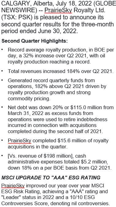
PrairieSky is unusual even among royalty companies. It has vast landholdings in Canada – over 18 million acres – only portions of which have been developed, so it doesn’t have any practical need to reinvest earnings to replace production (although it does do so). One of the only comparable such companies is Texas Pacific Land Corp (TPL) in Texas.
As with other royalty companies, the development and operating cost of the oil and gas reserves on its property is paid for by the leaseholders/operators. That is why, despite run-rate annual revenues of $800 million, and a $3.4 billion stock market value, it has only about 60 employees. The measure of this minimal expense structure is the extraordinarily high profit margins.
The June quarter net profit margin, after a 24% tax rate, was 55%. This was net of substantial non-cash accounting expense for depreciation and amortization. The free cash flow margin, net of spending on property acquisitions and exploration evaluations, was 72%.
Unusually for energy environment today, production volumes on its properties rose by 32% over last year, as operators increased their activities. The dividend yield is not unusually high, at 2.6%, but the payout was just raised by 85%. Most of the free cash flow is directed toward new land acquisitions.
This has been a strategic plan, and to good effect, for increasing the net asset value/share. In 2014, PrairieSky owned 40,000 acres of land per one million shares outstanding. Today the figure is 77,000.
Also unusual, PrairieSky’s ESG rating was just raised to AAA, and it was assigned the highest ((best)) ESG Controversies Score, apparently 10/10.
Addendum: A New Asset Class, Diamonds as a Fund-based (Equitized) Tradeable Commodity
In the universe of physical stores of value, gold has been the most widely accepted standard. The investment returns haven’t approached those of rare art or vintage cars, but that’s because the latter have the all-important feature of limited supply. There can only ever be one Mona Lisa, or 32 of the 1964 Ferrari 250 LMs. There can always be more gold, as is periodically learned whenever the price rises high enough and for long enough. The law of supply and demand in human affairs never expires.
However, those rare collectibles are not very transportable; that requires a team of trained technicians. In terms of portability, fungibility and transactability, gold wins. Then there are diamonds. Diamonds might have superseded gold over time as the standard for a quotidian, transactable store of value, but for one particular problem. Diamonds are not a commodity.
One reason is that they’re not fungible; you can’t sell a part of a diamond, in an ordinary course way, though you could sell a share of a very valuable diamond. That limitation could possibly be solved by carrying very small diamonds, like small-denomination gold coins. The real problem is that each diamond is unique, whereas any ounce of gold is just an ounce of gold. The value of each diamond must be assessed and confirmed. Which might be why they have drastically underperformed gold for decades.
If the value of diamonds could be standardized, as for a coin or an ounce of gold, they could functionally be a commodity. One could then transact freely with another party, trade $1,000 worth of diamonds for $1,000 worth of cash as easily as gold. In principle, commoditized diamonds would be a superior store of value than gold for the same essential rule of supply and demand: diamonds are rarer than gold.
By one estimate, 85% of all the diamonds that might be profitably mined have already been mined. They are found in very specific geological structures that are not widely dispersed across the globe.
Recently, as a benefit of modern computer technology, this problem has been solved. The company Diamond Standard has developed a statistical sampling and algorithmic method of individually selecting or optimizing for small groups of diamonds, say a half-dozen to a dozen in a group, from a sampling universe of millions, such that each set has precisely the same market value, irrespective of the mix of size, type, clarity and quality within each group.
These have been standardized into $5,000 and $50,000 ‘coins’ and ‘bars,’ which the company terms the Diamond Standard Commodity, and which are delivered as a physical, fungible commodity, not a security.
Diamond Standard has established itself as the world’s first market maker for loose diamonds, and has received regulatory approval from the Bermuda Monetary Authority. The physical commodity is to trade on spot exchanges once approved, and a CFTC regulated futures contract is expected to follow.
The investment opportunity, in part, is that because of the fungibility limitations, only about 1% of the entire diamond market of $1.2 trillion is held by investors. By contrast, 30% of the $9 trillion gold market is held by investors[14]. A great deal of investment demand could ultimately flow into the diamond market, raising the clearing price if and as this market equilibrates with the gold market.
If any environment in the past 40 years would be conducive to such a transition, this would be the time.
Indeed, in the 15-plus years from 2004 to mid-2020, diamonds returned about 10%, while gold was up a cumulative 328% and the S&P 500 292%. In the one year since June 2020, when Diamond Standard offered its first diamond commodity coin, diamonds have appreciated about 30%, rough parity with the S&P 500, while gold has declined.
This discussion is prelude to a new transaction – involving Horizon Kinetics and Diamond Standard as co-sponsors – the launch of the Diamond Standard Fund17. This will be a closed-end fund of standard packets of diamonds. That is an instrument that can pave the way for more proper, mass market adoption, in much the same manner as the Grayscale Bitcoin Trust (OTC:GBTC) did for bitcoin. This will begin life as a private fund for qualified investors, with the standard one-year waiting period before units could be traded on an exchange, so the path to mass-market adoption would have to wait at least that long.
Footnotes
[1]U.S. Percent Utilization of Refinery Operable Capacity (Percent)
[2]https://www.bloomberg.com/news/articles/2022-06-03/chevron-ceo-warns-not-to-count-on-new-us-oil-refinery
3 In December 1980, the U.S. money supply was $1.599 trillion, and in December 2019, it was $15.319 trillion. M2 , Consumer Price Index for All Urban Consumers: All Items in U.S. City Average
[4]The circumstance is more extreme now. Since December 2019, more than $6.4 trillion of money supply has been added to what had been a $15.2 trillion balance.
[5]These were two 10-year-plus stretches, from the 1990 recession to early 2001 (the Internet Bubble collapse) and from mid-2009 to late 2019.
[6]Explaining the inflation puzzle
[7]Why Is Inflation So Low? | St. Louis Fed
8 The ratio between the population above age 65 and most of the remainder of the population.
[9]https://carnegieendowment.org/2017/03/29/formation-and-evolution-of-soviet-union-s-oil-and-gasdependence-pub-68443#_edn1
[11]Although diwersification is a Peter Lynch turn of phrase from One Up on Wall Street, published in 2000.
[12]AUM for the stock and bond funds include all share classes
[13]Using the iShares Core S&P Total U.S. Stock Market ETF (ITOT) as a proxy. Similar underlying index. ITOT has 3,661 holdings.
[14]Sources: etfdb.com, Factset. As of June 30, 2022
[15]Companies described are for illustrative purposes only, depicted to demonstrate examples of attributes we consider during our investment process. Certain of the company names may be holdings in the Core Value strategy or other strategies or funds managed by Horizon Kinetics Asset Management LLC. However, reference to a specific company does not guarantee that such company is a holding in accounts or that it will continue to be a holding in the future.
[16]Diamond Standard | Invest in a Regulator Approved Diamond Commodity.
17Diamond Investment | Diamond Standard Fund Diamond Standard Fund is for accredited investors only.
Original Post | Listen | Watch
Editor’s Note: The summary bullets for this article were chosen by Seeking Alpha editors.
Be the first to comment