

piranka/E+ via Getty Images
We are suddenly beset by a confusion of worrisome events. Pressing questions about what they portend, what should or can be done in response. And, seemingly by the week, another issue and more questions. Such as:
- The stock market is down 24%, if you’re in the S&P 500, or 28% if in international stocks.[1] So, is it cheap now or not? Is it an early bear market or the makings of a bull market?
- The mega-cap IT growth companies are down 32%.[2] According to the fact sheet for the ETF – yes, there is an extended FAANG ETF – the annual earnings growth rate of these companies is 25.3%, and they’re 24.8x earnings. Is that cheap now? Or still expensive?
- Lower stock prices combined with corporate profit growth at the historical norm should produce the expected reasonable long-term return from stocks. Right? Assuming the profit growth norm in asset allocation models is correct. Could that even be up for debate?
- Investment grade bonds are down the most in a century: (13.9%) this year.[3] The prior worst full-year losses were (7.3%) for intermediate-term Treasuries, and (9.2%) for long-term government bonds.4
- Even the short-term bond index is down a stock-magnitude 6.6%[4], despite less than a 3-year average maturity. With a 1.5% distribution yield at the start of the year, four years of returns have been lost. Is it time to buy more bonds at the now-higher yield, or is that still risky?
- Is a 2.8% money market fund yield a good return now, vs. zero (more exactly, 0.02%) at the beginning of the year? But the year-over-year inflation figure is above 8%, so a money market fund loses value at the rate of 5%/year. Or will the Federal Reserve suppress inflation, so a money fund is a good bet?
- The bond market is only down because the Fed raised short-term interest rates by the most in its history: on a proportional basis by 1,200%, so far, from the absurdly low 0.25%. That’s good, because don’t higher interest rates reduce inflation by damping business activity? Is this even up for debate?
- Oil and gasoline prices are down 30% from their highs, thank Goodness. Is that because of the record-volume release of oil from the Strategic Petroleum Reserve? Or did the high oil prices suppress demand? Or is it that renewable energy projects reduced fossil fuel demand?
- U.S. corporate profit margins have just soared to their widest since 1950. Is that good, because it reflects economic strength? Or is it bad, because it’s peak profitability? Question: Is that even true? How is the level of profitability – which comes from audited financial statements – even a question?
- The British pound lost 16% of its value versus the U.S. dollar this year, and 9% during two weeks last month, an extraordinary decline and very nearly a 50-year low. And the Japanese Yen dropped 20% against the dollar this year. But a strong US Dollar will reduce domestic inflation, right?
- And gold and bitcoin have failed as inflation hedges, because they are near recent lows. So that answers that question. Or doesn’t it?
- Most recently, one of the most respected pan-market investors and strategists, suggested that the market be will flat (albeit volatile) for the next decade.[5] (??!)
This all seems very sudden. Can one possibly get clarity amid this confusion of events and record-breaking statistics?
Yes. But not from the news, which is short-term, reactive and disorganized, which has no stable frame of reference. One can get clarity by understanding that these events naturally follow from trends that have been developing and been visible for a long time. They form a framework within which these events seem neither random nor sudden. A framework that suggests methods by which to respond and even benefit.
We’ve previously laid out the systemic factors that have been operating for the past 20 and 40 years that led to this point of change. They have now run their course and can either no longer provide the earnings and valuation support they did or might now work in reverse. Keep those factors and long-term framework in mind, and you have the basis for interpreting this welter of events.
Unfortunately, not a day goes by without a new statistic, from which follows the interview-clip and instant-analysis engine of the investment news industrial complex. It is like single-factor answers that can be absorbed in a minute or two. You can always get quick answers, if you want them. But useful answers come from the history and context behind an event, and also contain the relevant quantitative as well as narrative facts. The telling and understanding can’t happen in a minute or two.
The challenge for us all is to not let the long-term framework we thought we had in our heads – the signal – get overwhelmed by the noise of the call-and-response cycle to the latest statistics or events, of which there are an infinite supply. In service of that challenge, we’ll use some of the recent financial news to remind ourselves of the longer-term trends that gave rise to them; and how that can inform security selection to position a portfolio for this new era.
Because I must tell you, there are now truly remarkable, historic-variety investment opportunities in this market. Our clients’ portfolios have been accumulating certain classes of them for some time, particularly the ‘hard asset’ and asset-light inflation beneficiary businesses. But there are new opportunities, created largely by the dominance of passive management these past dozen years or so.
The rigidity with which the massive, unending indexation-money inflows elevated an extremely limited number of companies to market value dominance and bubble valuations has, conversely, created valuation vacuums in companies and sectors that have been excluded from indexation.
Index exclusion means not only a low share price because of an absence of interest in a company’s shares, it also means exclusion from the ability to secure external capital for investment and growth, even for excellent businesses with alluring expansion potential. The return possibilities in many such companies whose businesses have suffered those twinned challenges for nearly a decade are extremely high, particularly where they perform or produce an economically critical service or good that was not in high demand for some time, yet which inevitably will be.
A final remark upon yet another historic shift, because this year the advantage has turned decisively from price-blind passive investing to active management, in particular to the value manager. The opportunities now are such that, in addition to our first ETF, which is uniquely centered on a business-model factor that is expected to specifically benefit from this new economic environment, Horizon Kinetics is now in the process of creating new actively managed ETFs, each with a discrete business sector or asset class focus.
There are many more interesting ideas today, for the forward-looking investor, than there were last year at this time.
Priority Presumption of the Day: The Federal Reserve Interest Rate Increases Will Suppress Inflation.
Rejoinder: For Structural Reasons, the Fed Can No Longer Control Inflation as it Once Did
The Federal Reserve’s new policy to combat price inflation is now one of the two most consuming topics in economic and financial news (the other being the direction of oil and gas prices). It is 40 years since the last inflationary period in the U.S., and it is the success of the Fed’s dramatic interest rate hiking policy of that era that infuses the investment community with confidence that the same will be done again. However, much has changed in national and global finances and capital flows since 1979. Enough so that monetary and fiscal policy tools that were effective then might have no power now or might have entirely different, counter-productive effects.
Reason One: The Fed Can’t Fight the Last Inflation War with Today’s Balance Sheet
There’s a presumption that the Federal Reserve can suppress inflation by raising interest rates sufficiently to restrain economic activity and demand. One hears about the “terminal rate” and when the central bank will “pivot.” That is, will the Fed Funds rate be raised as high as 4%, or 4.5% or 5%? Will this policy run its course by the first quarter of next year, or not until the end of next year? The confidence that a sufficiently high interest rate will quell inflation rests on the historic success of that approach by Paul Volcker, Fed chairman from 1979 to 1987.
Two sets of figures summarize that success: the joint progression of the Fed Funds rate and the Consumer Price Index. Starting from 5% in 1976, inflation rose rapidly year by year, reaching the 13% level in 1979 and 1980. The Fed Funds rate was raised from 4% in 1976 to 6.5%, then to 11%, then 15% and finally to 22% by 1980. For his defiance of political repercussions, Mr. Volcker’s name remains most respected.
|
Dec 76 |
Dec 77 |
Dec 78 |
Dec 79 |
Dec 80 |
Dec 81 |
Dec 82 |
|
|
Fed Funds Rate7 |
4.17% |
6.53% |
10.84% |
14.79% |
22.00% |
13.13% |
11.20% |
|
CPI (All Urban Consumers) |
5.0% |
6.7% |
9.0% |
13.3% |
12.4% |
8.9% |
3.8% |
That was the last inflation war. Here is the battlefield upon which it was fought: debt levels were low, at about 35% of GDP; the day-to-day finances were in reasonable balance, with an annual budget deficit of, call it a ‘normal’, 3% to 4%. The government had substantial financial flexibility.
Today’s field of play is very different. The debt/GDP ratio is 4x greater, at an all-time high of 127%. We’ve all seen the line graph by now: the leverage ratio rising decisively above the mountainous prior peak of 1946, which was justified by the massive and sustained World War II spending effort. Today’s annual budget deficit is also 4x higher than at the beginning of the Fed rate hiking cycle in 1978.
|
1976 |
1977 |
1982 |
1992 |
2002 |
2012 |
2021 |
|
|
Fed Debt, % of GDP |
35.2% |
33.9% |
34.3% |
62.4% |
57.2% |
99.6% |
127.0% |
|
Federal Deficit, % of GDP |
-3.9% |
-2.6% |
-3.8% |
-4.5% |
-1.4% |
-6.6% |
-11.9% |
|
Source: fred.stlouisfed.org |
One rejoinder: Interest expense as a proportion of the Federal budget is lower than in the Volcker period, and manageable, despite the higher debt level. That leaves maneuvering room.
|
1976 |
1977 |
1982 |
1992 |
2002 |
2012 |
2021 |
|
|
Net Int, Exp., % of Federal Outlays |
-7.2% |
-7.3% |
-11.4% |
-14.4% |
-8.5% |
-6.2% |
-6.1% |
|
Source: https://www.whitehouse.gov/omb/; Horizon Kinetics |
|||||||
Counter-rejoinder: It’s a false low. It exists only care of a decade-plus of artificially low interest rates. The average interest rate on the totality of Federal debt is only one-sixth of that in the Volcker era.
|
1977 |
1982 |
1992 |
2002 |
2012 |
Now |
|
|
Avg. Int. Rate on Total Federal Debt |
4.48% |
7.98% |
5.25% |
2.86% |
1.43% |
1.20% |
|
Source: www.whitehouse.gov/omb/; Horizon Kinetics |
||||||
To tackle the question, what if just the mildest aspect of the Volcker interest rate increases were instituted today, as opposed to the most dramatic feature, like the Fed Funds rate hikes from 10% to 20%? That can be done by looking at the change in the average yield across all Federal debt maturities, from 3-month Treasury bills to 30-Year bonds, which can only take place over many years.
One can see, in the accompanying table, how the 3-month Treasury Bill rates followed the Fed Funds rates very closely during the course of each year. They must, because they mature and are repriced every three months. In contrast, a 10-Year Note won’t mature for 10 years, unless refinanced early. It took five or six years for the short-term rate changes to filter through to enough of the longer-term maturities so that the average rate on all Federal debt caught up to the average on short-term rates five years later.
|
Dec-76 |
Dec-77 |
Dec-78 |
Dec-79 |
Dec-80 |
Dec-81 |
Dec-82 |
Dec-83 |
|
|
‘Spot’ Fed Funds Rate1 |
4.17% |
6.53% |
10.84% |
14.79% |
22.00% |
13.13% |
11.20% |
9.92% |
|
Effective Funds Rate 2 |
4.65% |
6.56% |
10.03% |
14.00% |
18.90% |
12.37% |
8.95% |
8.68% |
|
3-Month Treasury Bill |
4.34% |
6.13% |
9.28% |
12.04% |
14.30% |
11.08% |
7.92% |
8.97% |
|
Avg Int Rate on Total Fed Debt3 |
4.57% |
4.48% |
4.78% |
5.31% |
6.04% |
7.22% |
7.98% |
7.16% |
The average rate on all Federal debt increased by about 3.5% points, to 8%, between 1997 and 1982. A 3.5% point increase seems a reasonable, non-dramatic figure to use in a what-if exercise comparing today’s circumstance with the 1970s tableau.
|
GDP and Federal Budget Impact of a 3.5% Cost-of-Debt Increase in 1977 |
|
|
Dec-77 |
|
|
Federal debt at Dec ’77, OMB ($ bill.) |
$ 706 |
|
x Increase in avg int rate on Fed debt by 1982, from 4.57% to 7.98% |
3.50% |
|
= Increase in interest expense ($ bill.) |
$ 24.71 |
|
Increase in int exp, % of 1977 GDP |
0.7% |
|
Increase in int exp, % of 1977 Fed Outlays |
6.0% |
|
Avg Nominal GDP growth rate, next 5 years |
9.9% |
Say that it’s 1977, and you are modelling the economic impact of a proposed Fed interest rate strategy to suppress inflation, maybe for a presentation to investment advisory clients. And say you applied an educated guess that the average rate on all Federal debt would rise by that 3.5% over five years, keeping all else equal – just a snapshot view for evaluation purposes.
The result would be that the government’s interest expense burden on that year’s baseline GDP would increase by 0.7%. The increased interest cost would raise Federal budget, the outlays, by 6.0%. The question at the time would have been, could the economy handle this contractionary monetary policy?
As it turned out, it contributed to a deep recession, but average nominal GDP growth (meaning not reduced by the amount of inflation) in the next 5 years was 9.9%, which more than offset the increased expense. And the government’s balance sheet and budget position could easily handle the burden of the Fed’s dramatic interest rate policy.
|
The 1970s Inflation War, Same 3.5% Cost-of-Debt Increase, but Fought with 2022’s Balance Sheet & Budget Deficit |
|
|
Today |
|
|
Federal debt, OMB ($ bill.) |
$ 31,292 |
|
x Same 3.5% Volcker era increase in avg int rate on Fed debt, from 1.20% to 4.61% |
3.50% |
|
= Increase in interest expense |
$ 1,095 |
|
Increase in interest expense, % of GDP |
4.5% |
|
Increase in interest expense, % of Fed Outlays |
18.7% |
|
Source: Horizon Kinetics Research. For Illustrative Purposes Only. |
|
What would happen if that experiment were repeated today? If the average interest rate across all Federal debt maturities were to increase by merely the same 3.5% in the coming 5 years? The extra interest would:
− Absorb another 19% of the Federal
That would have serious social impacts, because only about 15% of the budget is truly discretionary. Formally, 29% of the 2022 Federal budget is discretionary, but Defense spending is over half of that. The Non-Defense Discretionary category is what pays for such programs as transportation, education, and health. (The 64% of the budget that is mandatory spending pays for programs like Social Security, Medicare and Unemployment Compensation.)
– And it would reduce GDP by 4.5%.
|
Federal Expenditures Budget, 2022 |
|
|
Total Outlays: |
|
|
Mandatory Expenditures |
63.9% |
|
Defense Spending |
12.9% |
|
Interest Expense |
6.8% |
|
Sub-total |
83.6% |
|
Discretionary Spending: |
16.4% |
|
100.0% |
|
|
Source: www.cbo.gov |
|
How serious is a 4.5% contraction in GDP? In the 75 years since 1947, there have been 301 calendar quarters. Of those, there were 45 quarters with real GDP declines (that is, after deducting the inflationary or pricing boost from the nominal GDP figure). A 4.5% decline would be the 12th deepest of the 45; it would almost make the top quartile by seriousness.
Rejoinder: We can grow our way out of it. That’s the way it’s always worked.
Rejoinder: We can grow our way out of it. That’s the way it’s always worked.
Counter-rejoinder: Tipping points.
Maybe this is the time it won’t work.
The question is whether the economy can equilibrate for those interest rate increases, the way it did in the 1970s. Financial market investors’ outlook is no doubt influenced in part by the past 10 and 20 years, by one of the great bull markets of all time. I mean, look at a one-decade chart of the S&P 500 to 2019!
Source: Factset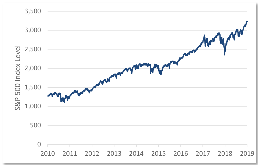
But, as good as the stock market might or might not have been, GDP growth in the past 20 years has been only 4.0%. The last 10 years was 4.1%. For benefit of the doubt, the 10 years through year-end 2019, before the Covid pandemic year, was also 4.0%.
|
Avg GDP growth rate, next 5 years GDP growth rate last 5 years Last 10 years 10 years to 2019, before Pandemic Year Last 20 years |
?? 4.5% 4.1% 4.0% 4.0% |
Rejoinder: But a 4.5% of GDP interest expense burden versus a historical 4% GDP growth rate might seem close enough. Anyway, these are rough estimates, based upon statistics that are surely imperfect.
Counter-rejoinder: True, these are rough estimates that are surely imperfect. Unfortunately, this example was unrealistically generous in leaving out a non-ignorable fact. It was a standstill snapshot based on applying a higher interest rate to the existing amount of debt. But in reality, the amount of debt is increasing rapidly above the figures used in this rough-and-ready example.
That’s because the ‘ordinary’ budget deficit of about 3% to 4% of GDP of the 1970s, could be equilibrated by a GDP that grew by about 3% to 4%. The budget deficit today is 11.9% of GDP. One full year of that, and the debt load will approach 137% of GDP instead of 127%. Debt is accumulating at a rate greater than economic growth can equilibrate for. That’s in addition to the rising interest cost of the existing debt eating into GDP at a rate that matches or exceeds the 4% economic growth rate of the 20 years. Plus, the non-discretionary budget, like for Social Security payments, is indexed to inflation and increasing rapidly.
The annual deficit -bills do have to be paid – requires that much more money to be created every year.
That is simply inflation by a different name, because when the money supply increases by more than economic output, any person’s money or savings becomes a smaller proportion of the total supply; it’s worth less and less. Approximately 31% of the total U.S. dollars in existence have been “created” within the past 2 years. That’s a far more transparent calculation than what goes into producing the CPI.
How rapidly might the average cost of the Federal debt increase?
Largest Real GDP Declines By Quarter, 1947 to 2022
|
Quarter |
% Change |
|
2020-04-01 |
(29.90) |
|
1958-01-01 |
(10.00) |
|
2008-10-01 |
(8.50) |
|
1980-04-01 |
(8.00) |
|
1982-01-01 |
(6.10) |
|
1953-10-01 |
(5.90) |
|
1949-01-01 |
(5.40) |
|
1960-10-01 |
(5.00) |
|
1975-01-01 |
(4.80) |
|
2009-01-01 |
(4.60) |
|
2020-01-01 |
(4.60) |
|
1981-10-01 |
(4.30) |
|
1970-10-01 |
(4.20) |
|
1957-10-01 |
(4.10) |
|
1974-07-01 |
(3.70) |
|
1990-10-01 |
(3.60) |
|
1974-01-01 |
(3.40) |
|
1949-10-01 |
(3.30) |
|
1981-04-01 |
(2.90) |
|
1953-07-01 |
(2.20) |
|
1960-04-01 |
(2.10) |
|
2008-07-01 |
(2.10) |
|
1973-07-01 |
(2.10) |
|
1954-01-01 |
(1.90) |
|
1991-01-01 |
(1.90) |
|
1969-10-01 |
(1.90) |
|
2008-01-01 |
(1.60) |
|
2001-07-01 |
(1.60) |
|
2022-01-01 |
(1.60) |
|
1956-01-01 |
(1.50) |
|
1982-07-01 |
(1.50) |
|
1974-10-01 |
(1.50) |
|
1949-04-01 |
(1.40) |
|
2014-01-01 |
(1.40) |
|
2001-01-01 |
(1.30) |
|
1947-04-01 |
(1.10) |
|
2011-01-01 |
(1.00) |
|
1957-04-01 |
(0.90) |
|
1947-07-01 |
(0.80) |
|
2009-04-01 |
(0.70) |
|
1970-01-01 |
(0.60) |
|
2022-04-01 |
(0.60) |
|
1980-07-01 |
(0.50) |
|
1956-07-01 |
(0.40) |
|
2011-07-01 |
(0.20) |
|
1977-10-01 |
0.00 |
The borrowings have a maturity structure. Currently, 15% of the $23.7 trillion of outstanding Treasury securities are Treasury Bills[7], so within a year there will be complete turnover at the new, higher rates. Another 58% are Notes, issued as 2-, 3-, 5-, 7- and 10-year maturities. If two-thirds of these, purely as a proportionate estimate, mature in the next five years, that would be another 35% or so. If so, then about 50% of the Federal debt will mature by that time, to be refinanced at higher rates. What might that look like?
The average yield of the 5-year Treasury over the past 5 years was 1.7%. The current yield is 4.0%, so new issuance will be 2.3% points higher even if interest rates don’t rise from today’s levels. The 2-year Treasury, in the past two years, averaged 0.3%; the current yield is 4.3%, so that sector of Treasuries will shortly cost the government 4% points more. Treasury bill yields will track or exceed the Fed Funds rate, so one has a good idea about those rate increases. That 3.5% average cost-of-debt increase from the 1970s example seems applicable enough.
Wait, wait, there’s more (debt)…
The above exercise considered only the Federal debt. There is also $4.0 trillion of municipal debt outstanding8. Those rates have risen sharply, too. All outstanding debt in the U.S., both public and private, is now $92.5 trillion9, which is 3x the size of the Federal debt. The Fed must take that into account when balancing the prospective impacts on the economy of interest rate increases, on the one hand, and unrestrained inflation on the other. There is going to be great value destruction in either case, whether fast or slow.
In essence, the nation’s growing debt leverage has been totally masked, as to the interest expense burden, by a monetary policy of ever lower interest rates, pushing the reckoning off to another year.
A Second Reason the Fed Can’t Fight the Last Inflation War: Today’s Global Capital and Commodities Markets
The Policy Defeating Influence of the Global Capital Markets
In the late 1970s, the international capital controls that had been in place since the end of World War II were only just being eliminated, starting first with the U.S. and only a few other countries. The pressures intentionally brought to bear by Federal Reserve domestic policies weren’t subject to much ‘leakage.’
Today, capital flows readily throughout the world. The elimination of capital controls permitted the development of true multi-national corporations, whose decisions about borrowing, lending, capital investment and tax management and even labor are highly flexible with respect to geography and jurisdiction. These degrees of freedom mean that the inflation problem cannot be addressed solely at the national monetary policy level.
The Fed can attempt to control price inflation by raising interest rates to discourage borrowing for investment purposes, thus reducing economic activity and demand, thus reducing price pressure. Yet, a U.S. company with global operations need not experience higher borrowing costs, since it can borrow funds in other currencies.
For example, in January, Berkshire Hathaway (BRK.A, BRK.B) sold over $1 billion of 5-year bonds in Japan, with a coupon of 0.203%. That was a premium yield for Japanese buyers, who otherwise had a choice of negative yields on 5-year government bonds or half that yield on Japanese corporate bonds. Simultaneously, it was 85% cheaper for Berkshire, since U.S. 5-Year Treasuries were trading at 1.5%.
The Fed’s policies can also be frustrated at the hands of a non-U.S. company. Although Nestlé (OTCPK:NSRGY) is a Swiss company, its main funding currency is the U.S. dollar, because it earns more money in the U.S. than from anywhere else. Since the U.S. now has the highest interest rates among the industrialized nations, Nestlé will tend to keep its cash balances in U.S. dollars and make more money available for short-term lending to earn the higher interest rate. In its small degree, Nestlé is engaged in expansionary monetary policy, thereby counteracting the Fed’s objective. It wouldn’t be the only company doing this.
The Policy Defeating Influence of Global Commodities Trading Markets
Like money flows, commodities trading is also a worldwide market. This year through October 12th, the U.S. dollar has advanced by 22% against the Japanese yen. One might be tempted to say that this is disinflationary, since it can enable U.S. consumers to substitute less-expensive Japanese products for American products. However, essential raw materials needed to produce these finished products, including natural gas, sell in U.S. dollars, thereby offsetting the theoretical Japanese labor advantage by a disadvantage in terms of the cost of raw materials.
In this instance, the problem for Fed policy is illustrated by the fact that the price of natural gas, which is used to produce electric power, rose by 33% this year, while the spot price of electric power in Japan increased by 85%.[8]
A Third Reason: Higher Interest Rates Can Be Directly Inflationary, Not Demand-Reducing
Modern economic theory often focuses on solutions to control inflation by reducing demand, as by increasing taxes or interest rates. High interest rates are used to restrain high oil prices because, if properly applied, demand for oil will be reduced. High real estate prices and rents could be solved by raising interest rates sufficiently to reduce demand. This approach is less concerned with the impact of excessive money supply, whereas historically that was presumed to be the cause of inflation – that is, a debased or diluted currency required more coins or paper to buy the same goods.
The flaw in the demand suppression approaches is that they ignore the phenomenon of demand inelasticity – when a change in price will not meaningfully change the quantity demanded.
Farming is a most basic example. U.S. farm sector debt is $496 billion.[9] Higher interest rates are simply a higher expense to a farmer, not unlike an increase in seed prices or animal feed. There is no alternative but for farmers to pass on those increased costs in their selling prices – if they can’t earn enough to stay solvent, food won’t be grown.
The utility industry is another example. Utilities are largely debt-financed, since the cost of debt is usually lower than the cost of equity capital. In fact, state utility commissions mandate leveraged balance sheets so as reduce the overall cost of capital. However, higher interest expense becomes nothing other than a reimbursable expense, and public utility law entitles the utility to compensation in the form of higher electric utility rates paid by utility customers. Here, too, higher interest rates are clearly inflationary, and explicitly mediated through the regulatory framework.
Another example is the healthcare industry, which represents roughly 20% of U.S. GDP, and is growing more rapidly than overall GDP. As far as demand suppression, surely people will not defer an emergency medical procedure because of higher interest rates. And since the majority of the U.S. population has health insurance, there is no reason to delay a medical procedure because of higher rates.
As to higher interest rates, they can be a direct inflationary mechanism in the health care sector, too. The largest U.S. health insurance provider is UnitedHealth Group, with a stock market value above $450 billion. It’s the world’s seventh largest company, by revenue and, by net premiums the largest insurance company. Yet, it has negative working capital of $(20) billion, and a $(3) billion net long-term debt position (net of investments).
Consequently, higher interest rates simply increase UnitedHealthcare’s cost of doing business, and those increased costs will be reflected in higher insurance premiums, not the reduced demand outcome for healthcare services presumed by monetary policy.
To bring this observation toward a more encompassing conclusion, annual interest expense paid on the $92.5 trillion of total public and private debt in the U.S. – total meaning everything from an auto loan to a UnitedHealth Group bond to a home mortgage and U.S. Treasuries – is now $3.45 trillion.[10] This must be the largest single national expense item. It dwarfs, by a factor of five, what the entirety of the U.S. pays for oil each year. At $85/barrel, $620 billion/year is spent to buy oil.[11]
On a national basis, therefore, can one reasonably anticipate anything other than that an increase in this interest expense burden will be reflected in the general price level? In which case, a higher interest rate is part of the inflation problem as opposed to the inflation solution.
A Fourth Reason: The Federal Reserve Can’t Cure a Structural Supply Shortage of Critical Commodities
Any review of the financial statements of hard commodity producers, in conjunction with the growth statistics of various industries and the global population, make quickly apparent that there is a structural supply insufficiency relative to demand trends for oil and renewable-energy-critical metals like lithium and cobalt, and base metals like copper and iron. There are a thousand ways to look at it. Here are a few.
First is the matter of reserve depletion. For the past eight years, following a self-inflicted oversupply situation with respect to expected demand growth (China, basically) and a collapse in those commodity prices, commodity producers have continually reduced their spending on exploration and production. The scale of those reductions is extraordinary. Nevertheless, they continued to produce the volumes the market required. As a consequence, they’ve been drawing down their reserves.
The accompanying table, just using Chevron, tracks production volumes and capital expenditures over the past nine years. Basically: flat production, but capital expenditures reduced by almost 80%. Chevron is a convenient stand-in; the example could as easily have been made with other energy or mining companies.
|
Chevron Corp. |
||
|
Production Volume (000 BOE/Day) |
Capital Expenditures ($ mill) |
|
|
2013 |
2,957 |
$37,985 |
|
2014 |
2,571 |
35,407 |
|
2015 |
2,622 |
29,504 |
|
2016 |
2,594 |
18,109 |
|
2017 |
2,728 |
13,404 |
|
2018 |
2,930 |
13,793 |
|
2019 |
3,058 |
14,116 |
|
2020 |
3,083 |
8,922 |
|
2021 |
3,099 |
8,056 |
|
Change: |
+4.8% |
(78.8)% |
|
Source: Company reports |
||
After a decade of disinvestment, what happens if more natural gas or copper is needed next year? Once demand begins to exceed immediate availability, there are incredible practical impediments to any meaningful increase in production.
− Major financial institutions have committed to avoid lending to fossil fuel companies.
− Drilling and mining projects face regulatory or litigation delays for permits, land, and zoning.
− Those obstacles aside, there are the pure logistics of resource identification, engineering and site development. The International Energy Administration and, independently, the CEO of the world’s second largest publicly traded copper company, estimate that a new copper mine would take 10 to 15 years to reach production.
There is a second level of impediment: a comparable shortage of the supporting infrastructure and of the oilfield equipment and service sector. Without these, reserve development and increased production cannot take place. These are equally serious limiting factors.
One of these is refinery capacity: you can be swimming in oil, but without a refinery there is no gasoline, jet fuel, asphalt, ammonia or any of the other derived fractions. There hasn’t been a major refinery built in the U.S. in 40 years, and it could take a decade or more to build one, if it is even feasible.
Another limiting factor – a heavy-duty variety of supply chain bottleneck – is oilfield equipment. If the U.S. government, even with the authority of the War Powers Act – who knows, Russia? – were to flat out order the oil companies to immediately ramp up production on any kind of sustained basis, it couldn’t happen. When the oil companies cut their capital expenditures by three-quarters, guess what their equipment providers had to do?
|
Halliburton Company |
|||
|
($ mill) |
Revenue |
PP&E |
Capital Expenditures |
|
2014 |
$32,870 |
$12,475 |
3,283 |
|
2015 |
23,633 |
10,911 |
2,184 |
|
2016 |
15,887 |
8,532 |
798 |
|
2017 |
20,620 |
8,521 |
1,373 |
|
2018 |
23,995 |
8,873 |
2,206 |
|
2019 |
22,408 |
7,310 |
1,530 |
|
2020 |
14,445 |
4,325 |
728 |
|
2021 |
15,295 |
4,326 |
799 |
|
Change: |
(53.5)% |
(65.3)% |
(75.7)% |
|
Source: Company reports |
|||
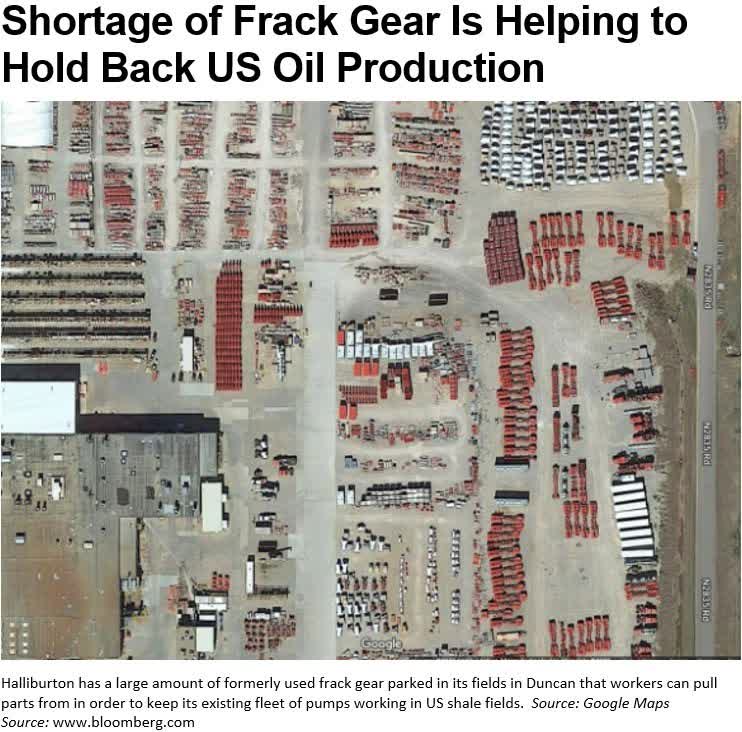
Halliburton, the second largest oil equipment service provider, has managed to remain profitable, but only at the cost of drastic downsizing. With only one-third of the property, plant and equipment it had 8 years ago, how can it possibly provide the equipment needed for ‘turning on the tap’ of oil production? There is one way it’s providing equipment at the moment: by cannibalizing parts from used equipment that it’s maintained in storage. Other than that, meaningfully increasing its capacity would be a multi-year endeavor.
And the Final, Real Reason the Federal Reserve Might Not Control Inflation: Maybe It Doesn’t Want To
Recall the accumulation of propositions from above. With those in mind, consider if the economy has passed a tipping point, to where it can’t outgrow the debt burden, just as someone’s credit card debt and monthly payment obligations might finally outstrip their capacity to keep up.
If that’s the case, then there might not be much mystery about what the Fed will ultimately do – one can dispense with all the questions about its terminal rate target and when it will pivot. The truly classic solution to this circumstance, other than an abrupt value-destroying and politically fraught devaluation, is to engineer a very gradual devaluation of the debt that is owed, through the dark magic of monetary inflation. How does that work?
Contrast the position of a cautious, disciplined saver versus a borrower. We’re talking of someone who owns money versus someone who owes money. The first party decides to put money aside for emergency rent, in case of disability. Its purpose is to pay for home health services, or perhaps a studio apartment close to medical services. That person is renter or buyer of services. The second party has borrowed the same amount of money to buy an apartment to rent out – maybe the very same apartment into which the saver will one day move. Here’s how their financial positions change during a period of inflation.
The renter has put aside $500,000, intended to last for 10 years of rent. This was based on the average monthly rent for a studio apartment in the 30 most expensive U.S. cities: $3,829.[12] That comes to $45,948 per year, so the $500,000 should last for 11 years. Wanting to ensure the safety of the money against bank failure or internet hacking, the money is kept in a safe.
The borrower has a mortgage obligation of $500,000, and receives initial rent of the same $45,948 per year.
The saver does finally need to downsize and move to a studio apartment, but 10 years have passed. At an 8% annual inflation rate, the rent is $99,198 per year, and the $500,000 will be exhausted in 5 years instead of 11.
The borrower/debtor still owes $500,000, keeping it simple. But the annual rent revenue is $99,198, more than twice the initial $46,000. The obligation has been dramatically reduced – the borrower can now pay it off with 5 years’ worth of cheaper, more plentiful money, instead of the 11 it would originally have taken.
|
Renter or buyer of services: inflation victim: Money saved for emergency rent or home health care Avg. studio apt. rent, 30 most expensive U.S. cities Per year Number of years of pre-funded rent Inflation at 8% 10 yrs, new rent Per year Number of years of pre-refunded new rent Debtor, Landlord: inflation beneficiary Amount owed, mortgage on apartment Rent received in Year 1 Years to pay off mortgage (simplified) Rent received in Year 10 |
$ 500,000 3,829 45,948 10.9 $ 8,267 99,198 5.0 $ 500,000 45,948 10.9 99,198 |
An inflationary monetary policy lets a government diminish the value of debt it owes by making the money used to repay the debt cheaper. It transfers wealth from savers to debtors. But, at least the damage is done slowly instead of rapidly, which is the usual political policy choice. And it is truly classic. Some might recall this example from a long-ago Commentary:
The Roman Empire debased its coinage for 2,000 years. As one example, during the 73 years between Marcus Aurelius’s reign ended in 180 CE and the beginning of the reign of Emperor Gallienus, the denarius silver coin was periodically debased – by mixing in a cheaper base metal, like lead – from 75% silver to only 5%, by which time the silver was just a surface coating that would wear off. That is 93% depreciation, which is the product of just 3.6% debasement per year.
2nd Priority Question of the Day: Oil
There’s a reason to take one more stab at this. We do still get questions about whether oil and gas are at risk from the growth of green energy and decarbonization initiatives, while energy is the largest sector allocation in many of our equity strategies, whereas in the S&P 500 it is one of the smallest. Which is the greater ‘bet’, the bigger mis-match risk relative to the future of the energy sector?
In the real economy, the pricing and supply of oil and gas probably portend greater top-to-bottom repercussions than any other factor. In the stock market economy, a doubling or halving of the FAANG+ might be as serious, but only really impacts the people who own the shares. If that logic holds, the S&P 500 poses the major risk relative to the real economy.
1) Necessity Assessment – Do We Really Need Oil?
Some more points about long-term oil supply limitations that spell far higher future energy prices. They’re points we might have touched on briefly in the past, reminders to stay focused on the framework for thinking about investing and inflation that will reshape investment returns in the next decade or two.
Oil is the keystone commodity of the industrialized world. Natural gas is primarily a co-product of oil production; the latter comes with the former. Liquid fuel is like a magic substance or advanced alien technology that enables modern civilization. You wouldn’t think about it that way, unless you think about it.
Without oil and gas, even other key commodities can’t be produced. There would be no metals mining (no diesel fuel to power the equipment, or the metals and tires that comprise the equipment), no plastics, no nitrogen-based fertilizer to grow crops (synthesized from the natural gas), no combine harvesters to reap the crops, no semi-conductors (natural gas is required for the intense heat to produce purified silicon, more energy intensive than making aluminum or steel[13]), and on and on.
The foremost authority about humankind’s use of energy and the chemistry and physics of the energy conversions society requires simply to live, must be Vaclav Smil. Having mentioned the reliance of agriculture on liquid fossil fuels, these are among the cornucopia of information-laden and terribly important statistics Professor Smil has calculated:15
Since 1801, progressing from human and oxen muscle power, through the introduction of steel plows, harrows and mechanical-but-horse-drawn harvesters in 1901 (a quarter of all American farmland then devoted to growing fodder for draft animals), to the 1970s’ widespread application of natural-gas based synthetic nitrogen fertilizers for high-yield varieties of wheat and rice, to the 400-horsepower tractors in 2021, this is the astounding magnitude of efficiencies gained in the production of our daily bread:
|
− |
In 1800, the share of the U.S. population required to farm in order to support said population was 83%; in Japan it was close to 90%. In essence, to provide the daily bread or bowl of rice. Today, U.S. farmers are 1.4% of total employment. |
|
− |
Or, measured by time, producing wheat now takes less than 2 hours of human labor per hectare (2.5 acres), compared to 150 hours in 1801. |
|
− |
This last figure, by order of magnitude, is a 98.7% reduction in labor. Or, in the inverse, a 7,400% improvement. Compare that with the popularly appreciated efficiencies of Moore’s Law for semi-conductor capacity improvement. |
|
− |
Or, the amount of human labor required to produce a kilogram of American wheat has been reduced from 10 minutes to less than 2 seconds. That’s a 99.7% reduction or, in the inverse, a more than 29,900% improvement. |
The salient point is that the extraordinary magnitude of economic and scientific development over the past 200 years, the improvements in food sufficiency and physical comfort, in medical care and transportation, has been enabled and levered up by the incomparable energy density of fossil fuel (save for nuclear power). In the data citations for the accompanying chart, you will note the reference to Professor Smil.
America might run on Dunkin, but Dunkin runs on liquid fuels.
2) Demand Assessment – How Has Demand Actually Behaved?
Population growth is inexorable, and it is denominated in a per-capita energy budget. Each person requires an increment of heat, light, shelter, food, clothing, transportation…
Within that general growth trend is a more rapid one. It’s a function both of the more rapid population growth in the non-OECD nations, magnified by their rising standards of living from exceedingly low levels. There’s a big increase in per-capita energy consumption when a portion of a population graduates from an earthen-floor house to one with a concrete slab, or from bicycles to motorcycles.
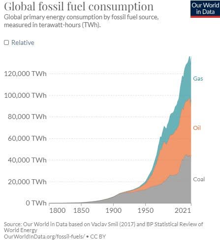
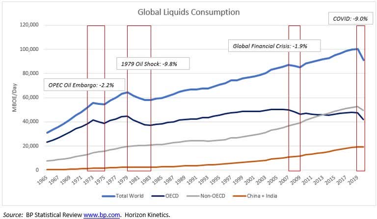
An overarching way to observe the power and persistence of this demand growth for energy is with the following chart of the 55-year history of the world’s oil and gas consumption. Taking in mind all of the global economic and geo-political disruptions since 1965, global consumption declined only 4 times.
Two were supply related (the OPEC embargo and the OPEC oil price shock of 1979). Another was the 2020 global Covid pandemic. The only purely financial or economic event that caused a temporary decline in oil consumption was the Global Financial Crisis of 2007/2008, which was catalyzed by the collapse of the U.S. housing and mortgage-shenanigan bubble.
One should take a particular look at the orange line in this chart, representing the combined oil and gas consumption of China and India. It did NOT decline during those periods. In 2020, when global liquid fuels consumption contracted by 9%, China’s and India’s joint share of global consumption rose from 19.2% to 20.9%. The Fed ain’t gonna be of any help here. Nor, for that matter, will U.S. fiscal policy. As to renewable energy (which is not the only climate-change solution), the proposition that it can substantially displace fossil fuels any time soon is not supported by the physics, chemistry or engineering technology.
This can be a very involved discussion, but for our purposes today an evidentiary shortcut will be presented to describe the reality to date. It will be a reminder of past discussions that intermittent energy sources like wind and power require an ‘always-on’ back-up power source for when it is too dark or insufficiently windy.
In the U.S., the utilization rate of utility scale solar projects is only about 25%, and for wind farms it’s about 35%.[14] Only fossil fuel generators or nuclear power plants can serve that back-up purpose at this time, so more renewable energy eventually requires redundancy via additional fossil fuel support. The shortcut evidence is Germany, one of the most committed and successful nations to date to seriously pursue decarbonization.
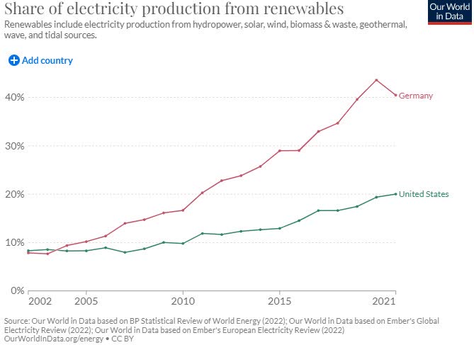
In 2002, Germany set a policy of lowering its greenhouse gas emissions in 2020 by 40% relative to 1990, and initiated a massive program to work toward decarbonizing its economy. In 2002, wind and solar accounted for less than 3% of electricity production. By 2021, they accounted for almost a quarter of total production. Total renewables sources, including hydropower and bioenergy, reached 40%, as shown in the accompanying chart. Double the U.S. progress. So far, so good.
However, aside from the intermittency problem, electricity is only part of an economy’s energy consumption, much of which isn’t going to be satisfied by solar or wind power. To borrow again from Professor Smil, he identifies four materials that he calls the four pillars of modern civilization: cement, steel, plastics, and ammonia. The reasons are fascinating and intensively researched, but too lengthy for this discussion. Two information tidbits, which, if they’re surprising to you, speak to the basic science ignorance gap that must be bridged in order to think about climate policy effectively.
Professor Smil ranks ammonia (synthesized from natural gas) at the top of the list, because without its use to produce nitrogenous fertilizers, he has calculated that 40% to 50% of the global population of 8 billion people could not be fed. He further calculates that manufacturing these four essential materials consumes 17% of the world’s primary energy supply and accounts for 25% of all the CO2 emissions from the combustion of fossil fuels.
Cement, which is very carbon intensive to manufacture, is made in larger quantity than any other material. There are practical limits to certain attempts to decarbonize the economy, although many avenues to reduce greenhouse gases certainly exist.
Back to Germany, in the two decades since it embarked on its green energy transition, and despite massive spending, the share of total energy provided by fossil fuels only declined from 85% to 76%, modestly better than in the U.S., despite doubling the U.S. progress in renewables penetration of electricity production. If that rate of progress were to be repeated, then even in 2040, economy-wide energy production from fossil fuels would still be 67%.

And there are subtleties within that picture. While fossil fuel use declined overall, led by coal, the natural gas share rose.
That describes much of the demand story. Without good and compelling data, one should be very wary about basing an assessment of future energy prices and inflation on the notion that oil and gas consumption will decline any time soon. This doesn’t mean that greenhouse gas emissions can’t be reduced, as they must. But there are many additional and achievable ways of making progress than the big two – solar panels and wind turbines – that now absorb so much of the attention and investment dollars budget.
The Market: Cheap, Expensive? Record Profit Margins? Not? What, exactly, is “The Market,” anyway?
The refrain, again, is that these will be broad observations of long-term trends and significant changes, which is often the best way to gain clarity in a noisy moment-to-moment environment. Noisy like this:
When in doubt, start with basic principles. The most transparent, all- encompassing way to gauge if stocks are expensive is to compare the market value of all stocks to the earnings power of the economy in which those companies operate and to which they contribute, namely GDP. To reality-check this, total U.S. corporate earnings, reported by the Bureau of Economic Analysis, can be compared with the index investors are more attentive to the S&P 500.
Total U.S. corporate earnings are obviously far broader. They include public companies not in the S&P 500, and private companies, but they nevertheless match S&P 500 earnings very closely over time.
GDP does not swing wildly. What swings is the valuation multiple that investors are willing to place on all those corporate earnings. Some- times investors are willing to pay a lot or too much, sometimes less or too little.
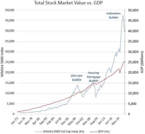
The accompanying chart shows the market value over time of the Wilshire 5000 Full-Cap Price Index (not reduced for insider ownership or float), which represents substantially the entire stock market, as opposed to the now very-narrow S&P 500.
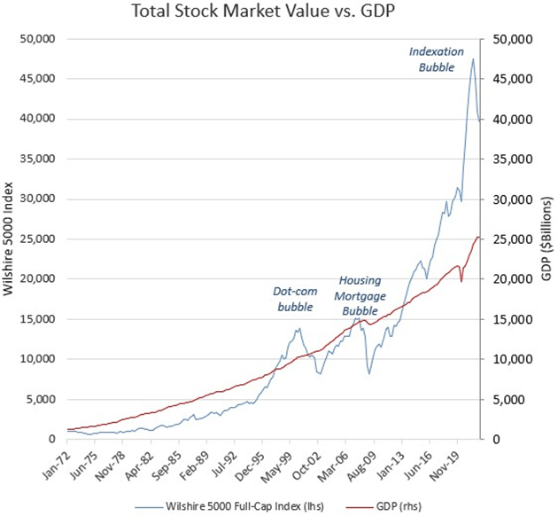
It compares that market value with the progress of GDP. Conveniently, they’re on the same scale, in billions of dollars, with the stock market at $40 trillion as of June 2022. As one would expect, the total stock market value sometimes rises well above the relatively steady GDP growth line, and sometimes drops well below. The Dot.com Bubble of 2000, and its aftermath, are clearly visible, as are the 2007 Housing Bubble and its aftermath, the Great Financial Crisis.
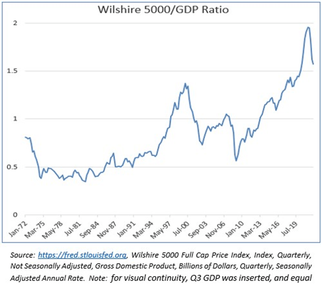
After this year’s 25% market decline, it is difficult to answer the question: “Is the market attractive now?”, if your focus is day-to-day or year-to-year. This long-signal valuation tool, though, the stock market/ GDP ratio, makes the answer seem obvious: the stock market remains at the highest valuation in 50 years.
For more precision, this next chart displays the same data with one line instead of two. It’s the ratio of those 2 lines: the total dollar value of the stock market divided by the dollar value of GDP. In the first 25 years of this 50-year span, that ratio stayed within a range of 0.35x to 0.85x, mostly in the 0.5x to 0.6x range. As of June, the valuation was 1.57x. Taking account of the decline since then, we’re at 1.49x.
Now, on to the rejoinder:
‘You can’t judge just on valuation multiple, because the stock market is the best discounting mechanism there is. If valuations are high, it’s because investors anticipate robust earnings growth.’
Translation: Most people, or enough people, think there will be lots of earnings growth.
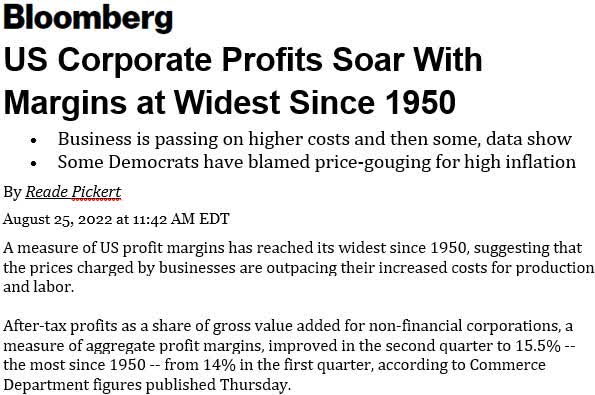
First, as to the assertion of robust earnings growth – and recalling the preceding charts – I can’t not ask: ‘More robust growth than was anticipated during the Dot.com Bubble?’ To be fair, it is difficult to contend with statistics from reputable sources, like the accompanying article that reports record corporate profit margins this year. I don’t believe it for a second, but it does require additional effort to understand why.
A place to start is by reference to the many systemic economic changes in recent decades that seriously aided net profit margins, but which are neither intrinsic nor permanent features of an operating business’s profitability. We’ve covered them before, among them large-scale reductions in these three corporate expense categories:
− wages, due in part to the global labor arbitrage enabled by the dismantling of national capital controls in the 1970s and ’80s;
− income taxes, due to repeatedly lower tax rates, plus the ability of multi-national U.S.
corporations to make use of jurisdiction-based tax-reduction strategies; and
− lower interest expense, via the Fed interest rate policies we’ve been discussing.
This is shown below in stepwise picture form.
First, here is the preliminary evidence of record high corporate profit margins for U.S. corporations: over 16% this year, up from 3% to 4% in the 1979 to 1982 period. Variations of this chart have been the subject of many recent articles.
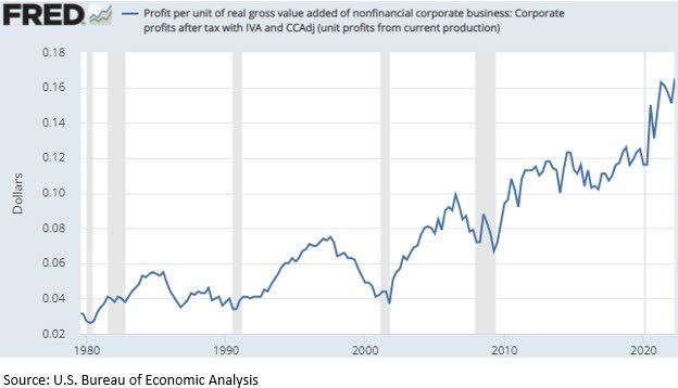

A large element of that profit margin improvement is employee compensation, because in many industries that is the single largest expense. At the end of 1979, compensation costs were measured at 65.5% of revenues. That declined steadily, to 59.2% in 2019, and 58.0% in the first quarter of 2022.
Next, taxes. For 40 years, the Federal government’s tax receipts on corporate income were remarkably flat, while corporate pre-tax profits nearly octupled. Government tax receipts as a proportion of corporate pre-tax income, which ranged between 21% and 24.5% in the 20 years between 1979 and 1999, declined to 9.1% by 2019, and marginally lower than that in the four quarters to March 2022.
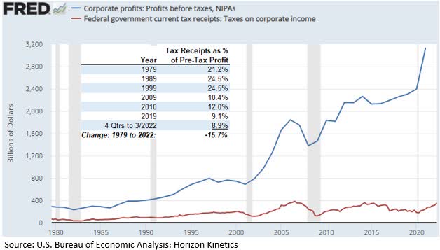
We couldn’t round up a handy picture of interest expense as a proportion of operating earnings for the same 40-year period. Interestingly, the Federal Reserve itself recently published a paper on this topic, though it restricts itself to the past 20 years. The first paragraph begins this way:
Over the past two decades, the corporate profits of stock market listed firms have been substantially boosted by declining interest rate expenses and lower corporate tax rates. This note’s key finding is that the reduction in interest and tax expenses is responsible for a full one-third of all profit growth for S&P 500 nonfinancial firms over the prior two-decade period. I argue that the boost to corporate profits from lower interest and tax expenses is unlikely to continue, indicating notably lower profit growth, and thus stock returns, in the future.[15]
Our own analyst, Brandon Colavita (also a portfolio manager of one of our actively managed ETFs), believes that the lower interest costs and tax rates could have accounted for 45% of the reported income growth of the S&P 500, if accounted for on a cumulative compounded basis, more the way investors tend to think about returns.
Add up 6-odd percentage points of profit margin expansion for declining relative wage expense over the last 40 years, 15 percentage points for declining relative tax payments, and a very generous-but-unknown slice of interest savings, and that has been some enormous benefit to corporate profit margins.
A very important point, here, part of the thematic throughline of this Commentary, is about informed estimation. I freely, even emphatically admit that I don’t know exactly how much corporate profit margins have benefitted from interest expense savings. Not even to a 1- or 2- or 3-percentage point level, much less to the 3rd or 4th decimal point. I doubt I can even figure it out.
Neither do I know how precise the other calculations are. They certainly couldn’t pass muster for publication in a proper financial journal. That’s the divide between the academic and professional econometrics-based investment world and the practical world of applied investment analysis.
One is not necessarily ‘smarter’ than the other; it depends on the application. A dog is not smarter than a cat, or vice versa; they are each as smart as they can be or need to be for their particular job detail and ecological niche. The key is that economics and finance are not a hard science, with absolute, repeatable constants and outcomes, like the speed of light or the rate of acceleration in the Earth’s gravity well, which don’t change.
The earth is round, though not perfectly, and it stays that way even if a new theory arises about it. Economics and finance are branches of social science, in which the repercussions of any action can change and have different implications based on how differently-incentivized observers behave and, more complexly, how other observers react to those responses or even anticipate them for their own advantage.
Which is to say, informed estimation doesn’t need to be precise. A wrong answer can be precise to many decimal points. Informed estimation usually only needs to be approximately right – as to direction and magnitude – about the relevant few variables.

The point is, when an article touts record S&P 500 profit margins or debates which quarter will be the turning point for interest rates or inflation, you now have a framework to judge what that does or doesn’t mean. In any case, this last chart shows what happened to the cost of borrowing for investment grade corporations between 1979 and 2019. By eye – and that’s ok – it looks to be roughly 14% points of cost-of-borrowing benefit for all the borrowing that’s taken place since then.
“The Market” Might Be at Record Valuations, But Not All of the Market
Reality Check on “Market” Valuations
As an objectivity test, here is a profile of a company that is not in our portfolios, and I don’t imagine it will be. It’s an example of the extreme valuation disconnect between index-centric stocks and those that index-based passive investing has hidden, in plain sight, because they aren’t in, or are only marginally in the major indexes. It’s a pretty ordinary company. It is not in the S&P 500. The largest ETF holder is the iShares S&P Mid-Cap ETF (IJH), in which it’s a 0.33% weighting. This is a thumbnail description:
|
− |
It has over $35 billion in sales, 15,000 employees, and is the largest competitor in its sector. |
|
− |
Founded in 1921, it is firmly entrenched in the economy and not at risk of obsolescence. |
|
− |
Consistently profitable, not cyclical (operating margins in 10 years have varied by only 1.4%). |
|
− |
Not debt leveraged. |
|
− |
Has little in capital expenditures, only about one-half of depreciation and amortization. |
|
− |
Strong shareholder financial returns (revenues/share and EPS in the past 10 years up 11%/year and 14%/year). |
What’s the valuation?
− The shares trade at 5.5x analysts’ consensus estimate of next year’s earnings.
One can debate whether that 5.5x P/E ratio is deserved because reflects other factors not in evidence above. But the same can be said about companies trading at 25x earnings, with no greater or lesser confidence. A 5.5x P/E ratio means the company could repurchase 18% of its shares each year, for a like degree of EPS growth. Or, it could pay out all of its earnings, for an 18% dividend yield. Not that it would or should. It’s an example of truly alluring valuation gaps that now exist in The Market.
What’s the company? Arrow Electronics, market value $6 billion, the largest distributor of electronic components in the U.S. It serves a critical role in the global technology supply chain – it distributes millions of parts required to assemble ever-more digitized consumer and industrial products. It offers over 550,000 varieties of capacitors, and over 3.3 million connectors, among other categories.
Portfolio Review
Any Changes?
Almost no portfolio changes were made last quarter. One of the very few was unintentional. It was the acquisition of CatchMark Timber Trust, a timberlands REIT, by PotlatchDeltic Corp. (PCH), another timberlands company. Timberland is a type of natural inflation hedge.
Unlike other resources, which are eventually depleted, trees are self-replenishing, and grow about 3%/year. CatchMark was positively exposed to a rise in lumber demand and higher wood prices, and did not engage in the capital intensive and more cyclical business of manufacturing wood products like plywood. Shares of PotlatchDeltic were received and are still held. A like holding in some portfolios is Rayonier, Inc. (RYN)
Earlier in the year, though, there were a few additions. They were a continuation of the portfolio prepositioning begun a number of years ago for an inflationary era.
In a number of strategies, a new position was established in Labrador Iron Ore Royalty Corp. (OTCPK:LIFZF) This is of a kind with our other ‘hard asset’ holdings, the most prominent of which is Texas Pacific Land Corp. (TPL) The description of Labrador Iron Ore Royalty will serve double duty as a review of the hard asset business model.
A hard asset company derives its revenues directly from an asset, like gold or oil, without any intervening operating expense or capital investment. As a contractual arrangement, it receives a proportion of the revenues – a royalty – generated by the third parties that undertake those burdens.
That is how the hard asset company can be directly and positively exposed to any increases in production volumes and prices without operating cost exposure. It is a powerful and elegant business model that has no peer in terms of profitability. It can generate substantial returns even when the underlying asset price does not rise. A few statistics will demonstrate.
Labrador Iron Ore receives royalties on a major iron ore mine in the northeastern corner of Canada. It also has an equity interest in the miner, IOC, which is controlled by Rio Tinto (OTCPK:RTPPF). The mine has many decades of reserves. Last year, the company had $280 million of revenues (Canadian $). That’s before substantial equity earnings from the mining company. Operating expenses were a mere $3 million, about 1% of revenues. Net of that and taxes, the free cash flow margin was 62%.
That level of profitability is pretty much without parallel, with the exception of another business model we own much of: securities exchanges.
Labrador Iron Ore has an extra source of earnings, its equity interest in IOC, the mining company, from which it received a dividend of $228 million last year. With the dividend, the profit margin was near 80%.
A brief compare-and-contrast with the actual mining company, IOC, illustrates the business-model difference. Aside from the Chair of the Board, Labrador Iron Ore Royalty has 3 employees. Its office space totals 355 square feet. It has no debt. IOC has 2,754 employees. It has a mine to operate and maintain, a railroad, a crusher, a 4-mile conveyor, a concentrator, a pellet plant. It’s profitable and debt free, and in a typical year might have a 25% or 30% free cash flow margin after capital expenditures. If the cost of equipment or labor rise, its profit margin contracts, unless it can offset that with price increases.
Labrador Iron Ore Royalty pays out the entirety of its cash flow. The most recent quarterly dividend, annualized, is C$4.00/share. The current share price is C$27, so the dividend yield is 14.8%. Last year, when ore prices were higher, the dividend was C$6.00, 50% higher.
One should also observe this very important investment characteristic, which can be seen with other royalty companies: in the 10 years to January 2022, iron ore prices were only up about 8% in total, or by less than 1% per year. Very few businesses can generate a satisfactory return with a decade of practically unchanged revenues. Yet, Labrador Iron Ore Royalty, with dividends, returned an annualized 10%. The S&P TSX Composite Index annual total return was 9.2%.
Other new positions, depending on the strategy, include two more hard asset companies that provide further diversification among critical raw materials.
One is Altius Minerals (OTCPK:ATUSF), a royalty company with a diversified portfolio that has been increasingly oriented toward the metals required for renewable and green energy projects, like copper, nickel and zinc. Potash, the crop fertilizer, provides about 20% of the royalty revenue. Global population growth means fewer acres of arable land per person, which means the need for fertilizers will be a constant. The reserves and resource lives of the various potash mines measure in the hundreds of years.
Altius also has a publicly traded subsidiary that assists in funding solar and wind power installations, likewise for a royalty interest. Another strength of the royalty business model is that the underlying project does not need to be profitable, it merely needs to operate and generate revenues, in the multidecade way that a utility scale renewable power plant is intended to.
The other new hard asset company is Ecora Resources (OTCQX:ECRAF).It, too, has been reshaping its royalty portfolio toward metals necessary to the electrification of the economy, but with a somewhat different mix. Aside from the base metals copper and nickel, it also owns cobalt and vanadium royalties. And 6% of royalty revenues come from the only non-fossil-fuel based source of always-on, high-output electric power: uranium.
Portfolio Posture
We categorize companies by functional business model, rather than by traditional industry sector names. An industry sector label doesn’t tell you how a company makes money or under what circumstances it will do well or poorly. It’s descriptive, not predictive.
For instance, the Financials sector of the S&P 500 includes securities exchanges alongside banks. CME Group (CME), the largest exchange, is essentially debt free, and collects fees on the transactions that third parties place at their own risk. A bank’s balance sheet can be leveraged 10x or more, earning a narrow interest rate spread on loans for which the bank is at risk if the borrower defaults. If “Financials” includes both types of companies, how can one know how that index sector will behave in response to a sudden rise in interest rate volatility, mortgage delinquencies or corporate bond defaults?
As bad as that scenario might be for a bank, it’s great for a securities exchange, because exchanges are where people go to hedge risk. Redefining a securities exchange as an asset-light croupier – that has information content. The croupier class of business organizes a venue, with little capital at risk, that facilitates transactions.
Our hard asset companies, which tend to be the largest portfolio allocation, should benefit directly from rising materials price in the new era of secular inflation and scarcity.
There are also holdings with indirect positive exposure to inflation. The financial exchanges might be the next largest segment. Unlike royalty companies, they require conventional operating activities and property and equipment for the generation of revenue. Their commonality with hard asset companies is that that they have extremely low variable costs.
With today’s technology, acting as an intermediary between buyers and sellers of financial instruments is now done almost exclusively via a computer platform, so processing an additional $1 million or $1 billion of trading volume is simply a matter of computation power, which approaches zero with scale. Higher volumes do not beget higher overhead costs or even much in the way of marginal costs.
Other classes of business with indirect but positive exposure to rising inflation and scarcity, and which operate with low variable costs, are land, real estate management, and asset management companies.
A step or two removed from those categories, there is exposure to business models that, although distinct beneficiaries of certain vectors of inflation or supply scarcity, operate with a more normal fixed cost structure. Some have very modest profit margins. However, during a period of price inflation, a business with a relatively constant margin experiences an expansion in dollars of operating earnings, even at constant unit volume.
And a very modest margin improvement, which often occurs in an inflationary environment, can lead to much higher earnings. For example, a profit margin that widens from 2% to merely 2.5% – still very low by most standards – is actually a 25% profit expansion. Such a model would include agribusinesses like Archer-Daniels-Midland (ADM), which is an agricultural products processing intermediary, or AutoNation (AN), which earn a certain margin per car.
Proposition: Gold and Bitcoin Have Failed as Inflation Hedges
Objection! Assumes facts not in evidence.
Not to worry, it happens all the time. It’s what we’ve been talking about today, drawing a conclusion from price patterns, short-term ones in particular. Or from the frequency pattern of how many news mentions some phenomenon gets. Patterns are everywhere, and it’s easy to infer information content where there is none. Like, the market must be cheap because it’s down 25%. Like oil and gas consumption must be down because renewable energy production has skyrocketed. Or in this case, “Gold (or bitcoin) is down again today, and meanwhile the new CPI reading ticked up.” There’s no knowledge framework in that noise.
Gold – The Better Evidence
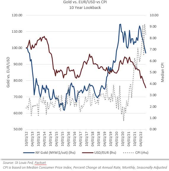
In the case of gold, the long-term history is that gold does not do well during inflationary periods. Rather, it is a hedge against dollar weakness. The confusion might exist because dollar weakness often accompanies high inflation.
Protection against currency debasement has been gold’s primary function even before there was a U.S. dollar. All that’s happened lately is that the dollar has appreciated dramatically because the Federal Reserve made U.S. interest rates the highest among the advanced economies. That induces non-U.S. investors to purchase dollar denominated assets, which requires the purchase of U.S. dollars.
If you want a price pattern, here are the comparative price changes gold and the dollar exchange rate over the past decade. Pretty well correlated. Gold against the Consumer Price Index? Not so much.
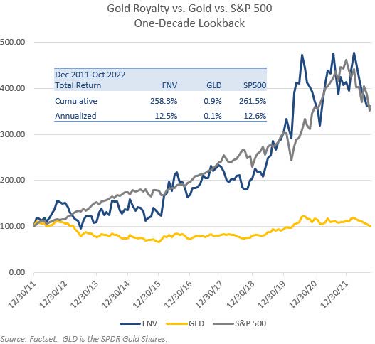
Back to basic principles. We don’t hold gold in client portfolios, we hold gold royalty companies. The two have surprisingly little in common. The gold royalty company generates very impressive profits even if the gold price never rises, and it earns those profits year after year. Here is a long-term chart of Franco-Nevada Corp. (FNV), the premier gold royalty company vs. gold itself: a comparable gold price today than a decade ago, yet Franco-Nevada returned 12.5% annually, matching the S&P 500 return, despite its near sole source of revenues unchanged.
What will Franco Nevada’s earnings and share price do if gold rises over the course of a decade?
Bitcoin – The Better Evidence
People love bitcoin price pattern watching; it has the highest peaks and the lowest valleys. Over and over. There’s no causative or predictive information content in it, though. That information does exist, and it’s freely available to the public, but it’s not yet familiar to the public. Almost guaranteed, this information has yet to be heard on a financial news program. When more people learn where to get that information, then bitcoin will be a lot less volatile, for reasons discussed below. This is actually just the circumstance where the efficient market theory of information dissemination does (or could) operate.
To understand bitcoin’s price behavior, it is necessary to know that the business of mining is at the center of it. As a business, there’s a certain required profit margin to justify the operating and capital costs of the machinery. Bitcoin’s price changes in response to that cost structure in a way that is like (though not entirely like) that for other commodities. If the cost of diesel fuel and fertilizer rise sharply, a wheat farmer has little choice but to raise the selling price.
If that can’t be done, the farmer will have to cease operating. By the same token, if a farmer’s unit costs suddenly decline because a new generation of combine harvester is 25% more efficient, the farmer will lower the selling price. Why? Because if not, some other farmer will sell wheat at a lower price and take volume from the farmers who don’t lower their prices.
In the case of bitcoin, the primary operating cost is electricity to power the mining servers. Like a new generation of combine harvester, there are new generations of servers. There’s a new, improved model every couple of years. But improvements in mechanical equipment can’t happen on the scale they can in electronics. In the seven years since the 2015 model of mining equipment and the 2022 model, electric power consumption per unit of processing capacity has dropped 92%.
|
Mining Server Electric Consumption |
Release Year |
Power Consumption (watts/h) |
Hashing Power (TH/s) |
Power Efficiency (watts/TH) |
Decline in Power Consumption |
|
Bitmain Antminer S7 |
2015 |
1,293 |
4.7 |
273.4 |
|
|
Bitmain Antminer S9 |
2017 |
1,372 |
14 |
98.0 |
-64% |
|
Bitmain Antminer S19 Pro |
2020 |
3,250 |
110 |
29.5 |
-70% |
|
Bitmain Antminer S19 XP |
2022 |
3,010 |
140 |
21.5 |
-27% |
|
Cumulative, since 2015 |
-92% |
||||
|
Source: Realtime mining hardware profitability | ASIC Miner Value |
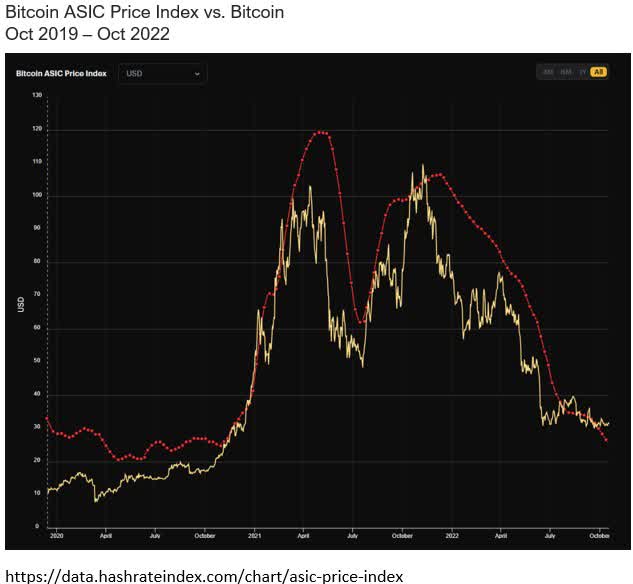
If you want a really impressive factor-based price pattern for bitcoin – an explanatory one – you can go to the website referenced below, which tracks the price per unit of processing power (measured in TH/second, or tera hash, which is trillions of transactions/second). This chart tracks of bitcoin, in yellow, against the index of the price/TH of the latest-generation bitcoin mining equipment. Yes, this is so fundamental in the bitcoin mining industry sector that there is such an index.
The 60% year to date drop in the price of bitcoin? Just a 1:1 function of the declining cost of producing a bitcoin.
But, in 18 months, the bitcoin reward miners receive will be halved; it’s just the way the system works. That’s a 50% reduction in revenues. Many will be unprofitable unless the price of bitcoin rises. If a wheat farmer’s cost of diesel and fertilizer rises 50%, the price of wheat has to rise, too.
But the market does discount, and the price should start to rise before then. And there are other factors. Eventually, if/when enough people own bitcoin, it will be a parallel currency and will be behave like an inflation hedge instead of a commodity.
That’s a knowledge framework.
Late Inning Question
A client sent some questions in yesterday about a controversy at a certain hard asset company. The mining company that pays the royalty on the production at a certain mine wishes to renegotiate a lower royalty rate. As a negotiating tactic, it has ceased production to deprive the hard asset company of revenues. The questions are detailed and show a close reading of the documents, such as about deadlines for action and the tactical flexibility afforded by the miner’s various operating facilities and subsidiaries.
In the spirit of the theme of this Commentary, it should be possible to respond qualitatively, without reference to that level of short-term detail – despite such detail being necessary to investment research.
We now live in an inflationary environment and, at the end of the day, will have to accept that fact. There is great demand worldwide for this particular commodity, and that will only grow. The mine in question has very high quality, attractive deposits. While the short-term picture, what with various assertions and regulatory or legal filings, might seem complex and uncertain as to outcome, here we come to a few more of the powerful advantages of the hard-asset business model.
One has to do with staying power, and was one of the questions sent in:
When do you think the “rubber will meet the road,” i.e., how long can each party go, between the company’s desire for distributions from its royalty vs. the miner’s desire for a high-quality resource, but at a lower price?
An active mine is constantly being maintained. If idled too long, the infrastructure begins to degrade from normal weather conditions, as from water damage and road deterioration. This are no minor matter. The longer it is inactive, the more expensive it is to resume operations. Time works against the operator. As to the hard asset company, we earlier noted that Labrador Iron Ore Royalty, with $280 million of revenues, has only 3 employees. There is probably no other type of business with that kind of staying power.
Another advantage: royalty rights stay with the property and the royalty owner, even if a given operator should fail and declare bankruptcy. In this particular case, if another mining company ultimately decides to acquire the mine, the royalties continue to redound to the royalty owner.
Finally, there is a pure investment analysis question. Put yourself in the position and mindset of a royalty owner of a hard commodity, whether it’s oil, copper or potash.
Your carrying costs are nil. Even a miner who decides to idle the operations has significant carrying costs; could be real estate taxes, equipment storage and maintenance, a skeleton crew of administrative and maintenance staff, insurance premiums, perhaps interest expense, and so forth. You, as a royalty owner, have no such worries.
Second, your reserves, even if they can be exploited for 20 years or 30 or 50, will eventually be depleted. Why would you want to accelerate that? Given the developments in today’s environment, you fully expect that demand and pricing one year from now, and more assuredly 5 years from now, will be higher. You might decide that you will generate more ultimate wealth from depleting reserves later rather than immediately.
|
IMPORTANT RISK DISCLOSURES: The charts in this material are for illustrative purposes only and are not indicative of what will occur in the future. In general, they are intended to show how investors view performance over differing time periods. Past performance is not indicative of future results. The information contained herein is subject to explanation during a presentation. Certain of the material herein is intended to portray the general nature of investor communications provided by Horizon Kinetics from time to time to existing clients. None of the investments or strategies referenced should be construed as investment advice and just because one investment is appropriate for one account does not necessarily mean it is appropriate for another. No investments should be made without the analysis of, among other things, an investor’s specific investment objectives, which considers their overall portfolio and any income requirements. The accounts referenced herein pursue an unconstrained strategy – meaning they are not limited by capitalization, geographic region, or investment techniques. They generally primarily seek capital appreciation with a secondary objective of income. Note that indices are unmanaged, and the figures shown herein do not reflect any investment management fee or transaction costs. Investors cannot directly invest in an index. References to market or composite indices or other measures of relative market performance (a “Benchmark”) over a specific period are provided for your information only. Reference to a Benchmark may not reflect the manner in which a portfolio is constructed in relation to expected or achieved returns, portfolio guidelines, correlation, concentrations, volatility or tracking error targets, all of which are subject to change over time. This material references cryptocurrencies, including bitcoin. Horizon Kinetics’ subsidiaries manage products that seek to provide exposure to bitcoin and other cryptocurrencies. The value of bitcoins is determined by the supply of and demand for bitcoins in the global market for the trading of bitcoins, which consists of transactions on electronic bitcoin exchanges (“Bitcoin Exchanges”). Pricing on Bitcoin Exchanges and other venues can be volatile and can adversely affect the value of the bitcoin. Currently, there is relatively small use of bitcoins in the retail and commercial marketplace in comparison to the relatively large use of bitcoins by speculators, thus contributing to price volatility that could adversely affect a portfolio’s direct or indirect investments in bitcoin. Bitcoin transactions are irrevocable, and stolen or incorrectly transferred bitcoins may be irretrievable. As a result, any incorrectly executed bitcoin transactions could adversely affect the value of a portfolio’s direct or indirect investment in bitcoin. Only investors who can appreciate the risks associated with an investment should invest in cryptocurrencies or products that offer cryptocurrency exposure. As with all investments, investors should consult with their investment, legal and tax professionals before investing, as you may lose money. The S&P 500 Index (“SPX”) is a broad- based index widely considered as a proxy for overall market performance. It is the property of Standard & Poor’s ®. This is not an offer to sell or a solicitation to invest. Opinions and estimates offered constitute the judgment of Horizon Kinetics LLC (“Horizon Kinetics”) and are subject to change without notice, as are statements of financial market trends, which are based on current market conditions. Under no circumstances does the information contained within represent a recommendation to buy, hold or sell any security, and it should not be assumed that the securities transactions or holdings discussed were or will prove to be profitable. Subsidiaries of Horizon Kinetics LLC manage separate accounts and pooled products that may hold certain of the individual securities mentioned herein. For more information on Horizon Kinetics, you may visit our website at www.horizonkinetics.com. Not all investors will experience the same holdings, returns or weightings as the corresponding composite. No part of the research analysts’ compensation was, is, or will be, directly or indirectly, related to the specific recommendations or views expressed by the research analysts in this report. No part of this material may be copied, photocopied, or duplicated in any form, by any means, or redistributed without Horizon Kinetics’ prior written consent. ©2022 Horizon Kinetics LLC ® All rights reserved |
Footnotes[1] The MSCI EAFE index [2] The Vanguard Information Technology Index Fund ETF (VGT) through Sept. 30th. [3] iShares Core U.S. Aggregate Bond ETF (AGG), this year through Sept. 30th. Average maturity 8.7 years 4 Stocks, Bonds, Bills, and Inflation. Roger G. Ibbotson. [4] Vanguard Short-Term Bond ETF (BSV), tracks the Bloomberg U.S. 1-5 Year Gov’t/Credit index. [5] Stanley Druckenmiller, 9/15/22 [7] SIFMA Research, US Treasury Securities Statistics – SIFMA9www.usdebtclock.org, at 10/10/22. [10] www.usdebtclock.org, at 10/12/22. [11] 20 million barrels/day x $85/bbl x 365 days/yr = $620.5 bill./year [13] Smil, Vaclav. How the World Really Works. Penguin Random House UK, 2022. [14] Electric Power Monthly – U.S. Energy Information Administration (EIA) [15] Smolyansky, Michael (2022). “The coming long-run slowdown in corporate profit growth and stock returns,” FEDS Notes. Washington: Board of Governors of the Federal Reserve System, September 06, 2022, The coming long-run slowdown in corporate profit growth and stock returns. |
Editor’s Note: The summary bullets for this article were chosen by Seeking Alpha editors.
Be the first to comment