

Iuliia Anisimova/iStock via Getty Images
By Rob Isbitts
I don’t know if I am the first investment professional to coin the phrase “Candy Cane” chart pattern. But I checked the first page of a search engine carefully and nothing came up, so I’m going with that assumption. Now, what the heck is a Candy Cane chart pattern, what does it look like, and why should you care?
Let’s start with this prologue: securities and broad market areas in general tend to exhibit a wide variety of price patterns. That is, they come in many shapes and sizes. Technical analysis has been around a very long time, though not nearly as long as Christmas. And not as long as candy canes, which according to History.com, date back to the year 1670.
The Candy Cane pattern: Just in time for… 2023!
The Candy Cane pattern, as I define it, is when a security has a strong up move in price over a relatively short time frame, then reverses quickly, giving up a modest fraction of the up move. Think about that: if you hold something, you make a nice short-term profit, then it “rolls over” in a way that makes it look like the candy cane sticking out of that red coffee cup in the picture attached to this article. For some investors, and for many traders, this is likely to get your attention. Smooth sailing has now become “oh, was that the whole move?”
In the decades I have managed money professionally, I have had many situations that acted like a double-edged sword: the research and buy point was sound. It was so sound that the security purchased accelerated higher, much faster than I figured. After all, whether you use fundamental, quantitative, technical analysis or all of the above (as I do), there is always a “risk” you will very right, very quickly. If it is a true long-term position (intend to hold it for multiple years), you probably ignore things like Candy Cane technical patterns. You are in it for the long haul, or so you tell yourself.
But this is 2022, going on 2023, and the market climate has changed like autumn turns to winter in much of the world. So here we are, in a stock market down 20-30% or much more if you held the lower-quality/hopeful-growth stocks. And, to make matters more distressful, the bond market is not cooperating like it always did (at least since the 1970s). If there is anything we can say about 2022 other than how tough it was to make money, it is this: even when you get a strong upward move, or a so-called bear market rally, it is rarely sustainable. That has created Candy Canes all year. But they are popping up as much as ever now.
3 Candy Canes, 1 big investors’ headache
So, let’s look at 3 examples I picked out. I could have picked out probably 300 just from the S&P 500 alone. But since we are limited for space, I chose a few I thought could collectively make the point about Candy Cane patterns, and provide some direction as to how to assess them when you see them. Because while in my experience, this pattern most often continues lower in price, I won’t assume that every investor sees that as a bad thing. After all, this is technical analysis, which some (like me) swear by, and others still consider voodoo as was the case half a century ago, before algorithms, hedge funds, the biggest trading desks and other large market participants started to swear by them too.
I was going to choose the more popular capitalization-weighted S&P 500 ETF (SPY), but the Candy Cane pattern it formed when I formed the idea for this article last week has already broken down further. Thus, it doesn’t look like a Candy Cane anymore. See my bearish articles on the standard S&P 500 in Seeking Alpha over the past several weeks for more on that.
So instead, we’ll examine Invesco S&P 500® Equal Weight ETF (RSP), which holds the entire S&P 500 list, but instead of weighting them according to how large the company’s stock is, it weights them equally. This is a great time to view RSP, because just the fact that its Candy Cane pattern is developing more slowly than that of SPY, it signals to us that the technology sector, FAANG stocks and other highly-weighted S&P 500 components have dropped. However, the rest of the market may not be far behind.
RSP: Candy Cane (TC2000)
In all of these charts, I circled the current Candy Cane pattern. In the case of RSP, this is the second time this year it has shown this distinct, bearish-leaning pattern. Last time, the “round trip” when the pattern completed looked like this: $130 a share in mid-June, a price peak exactly 2 months later at $153 was the long, left portion of the “Cane.” RSP bottomed 2 month after that peak, in mid-October, at around $125. So, a gain of about 18% in 2 months, a Candy Cane pattern starts to develop around $145, there’s a flash bounce, and then a dive to complete a 19% decline and wipe out more than 100% of the gain.
This is where the rubber meets the road for modern investors. You can ignore these and other volatile-market indicators in the name of “buy and hold” investing. Or, you can make some room for what I firmly believe in: that the market tells us a story. We just need to listen to it! Or, as a more basic rule of mine: “Avoid Big Loss.” And don’t turn tolerable losses into “wish I had done something” situations.
Stocks can get in the spirit, and bonds can too
Next up is iShares 20+ Year Treasury Bond ETF (TLT), one of most popular ETFs that tracks the bond market. It tracks long-term US Treasuries, considered among the safest assets on the planet. However, that reputation is based on the US Government having a strong history of repaying creditors, no matter how much more they have to borrow to do so.
This says nothing of the ability of ETFs like TLT to do their best S&P 500 impression, as they did during much of 2022. As I write this, TLT is off 27% for the year. It declined as much as 44% peak-to-trough at one point this year. This was always a potential scenario, and all it took was the sharpest rate hike cycle in modern history to prompt it. So, what now, given that TLT joins RSP in the holiday spirit, sporting a Candy Cane price pattern?
TLT: Candy Cane (TC2000)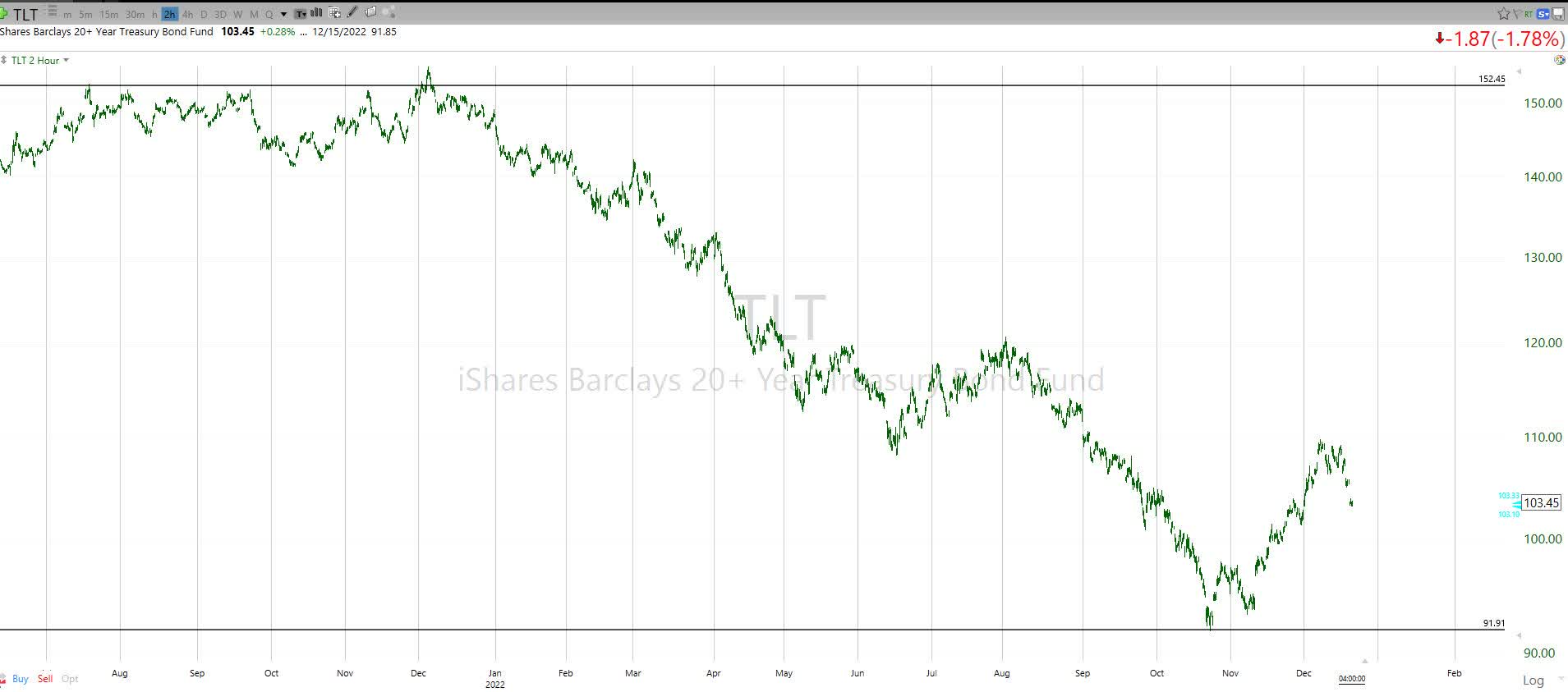
Granted, I’m looking at these charts with a sole focus on the Candy Cane price pattern, as opposed to the small set of indicators I consider to be powerful assessment tools to weigh reward and major risk of loss potential for any security. But what I see in TLT flies in the face of a lot of market commentary I have seen lately. It seems many folks are concluding that the rise in long-term bond rates is over, that rates are peaking and that ETFs like TLT are a “steal,” given how much they have fallen. The Candy Cane says, “wait a minute.” After all, the same pattern we just saw exists here too. In the case of TLT, a 20% rally in a flash, and about 1/3 of that erased in a hurry. My bottom-line here: TLT is still in a downtrend, and I’m going to be a Missouri-type until there’s more price momentum. In other words, I am still in “show me” mode with this one.
Consumer Staples: a Candy Cane chart that speaks volumes
Finally, we look at the one that to me, is potentially the most disheartening to near-term and intermediate-term market bulls. This is Consumer Staples Select Sector SPDR® ETF (XLP), one of the 11 sectors of the S&P 500. This is perhaps the one considered as a “flight to quality” and a place to hide for equity investors amid all of the bearish price activity this year. But guess what happens when so many traders and investors jump on board the “relative safety” train? The security’s valuation get stretched (XLP currently trades at more than 25 times trailing earnings, according to YCharts). And, guess what else happens? That buying frenzy eventually fades, leading to… you guessed it… a Candy Cane technical price setup. Here it is. In addition, XLP is sporting a more common, traditional pattern, a “triple top” which you can see by virtue of its price peaking around $77-78 a share on 3 separate occasions during 2022, starting in early January, when the broader market peaked.
XLP: Candy Cane (TC2000)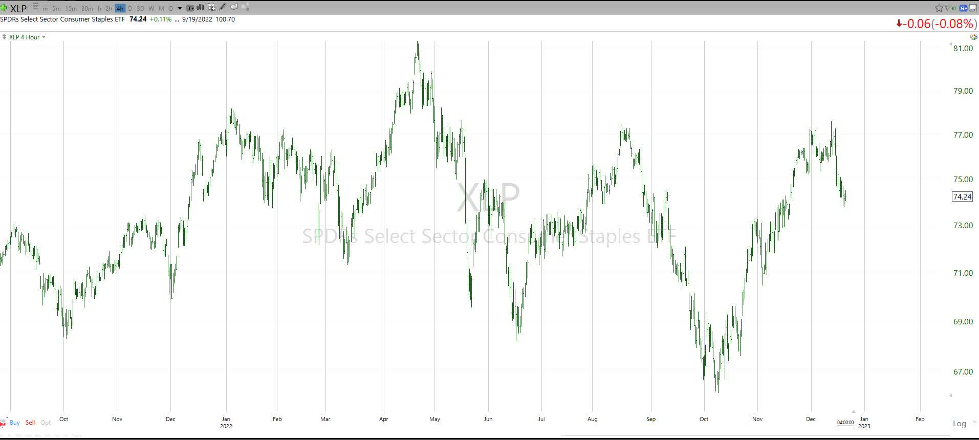
Let’s not overdo it. But let’s simplify it!
This Candy Cane pattern may have been given its name by yours truly, but that doesn’t mean it is new or unique. I suspect there are hundreds of my fellow market technicians who have their own names for it or will point me to a decades-old books on technical analysis. As with any style of securities or market assessment, technical analysis is simply an input to one’s own investment process and strategy. So, investors are best to stop short of considering anything here (or anywhere in investment research and opinion) as some sort of destiny for any of the securities or markets mentioned here. As much as candy canes, trendlines, P/E ratios or earnings forecasts may have aided investors in the past, 2022’s dominant message is that past is never assured to be prologue.
My point here was pass by the usual spaghetti-line-filled technical analysis, avoid using terms like Fibonacci and Stochastics (like I just did!), count number of days since some event occurred, or any of the wide variety of viable, or at least popular, technical analysis tools. As complex as investing can be, at times like this, I have found it best to keep it simple. As simple as seeing a Candy Cane in series of charts, among the hundreds I review every week in my own research.
The Candy Cane analyses here are both simple and seasonal. And there’s really only one set of general points to all of this: in any market, but particularly like this one, it is best to train yourself to look in many directions, scout your holdings and potential holdings from many angles, and learn to identify patterns that call for heightened risk-management. No matter what you call it, winning long-term investing starts with not losing big along the way. And currently, in both stocks and bonds, there is too much negative price action to just hope this all passes.
Be the first to comment