

Khosrork
As for the 1-month relative performance, the Financial sector has been the best with a return of 2.2%.
1-month performance of sectors (Finviz)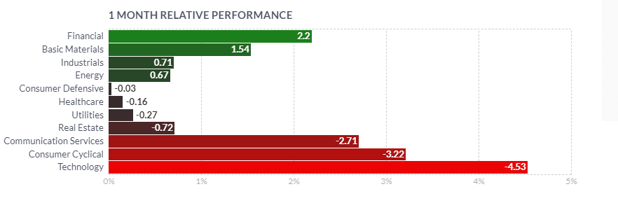
The 1-week return of the Financial sector has been amongst the three leading of the economy, with nearly 3% return.
1-week performance of sectors (Finviz)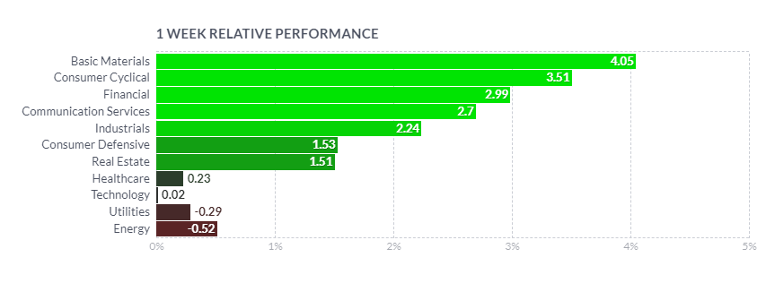
On the level of the Financial sector, the Insurance – Diversified industry, to which Berkshire Hathaway (NYSE:BRK.B) is classified on Finviz, was the second best-performing group with a 3.41% gain, right after Banks-Diversified.
1-month performance of industries within the financial sector (Finviz)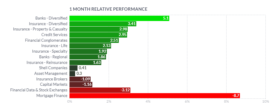
On the 1-week return basis, Insurance – Diversified industry was amongst the average performers, with a gain of 2.78%.
1-week performance of industries within the financial sector (Finviz)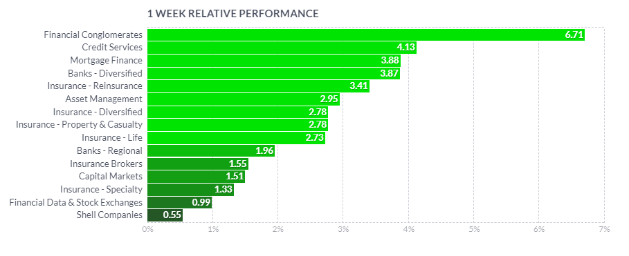
Peers?
Berkshire Hathaway is such a diverse animal when it comes to its business holdings as well as its importance for the US economy that I decided to compare it rather to Dow Jones and S&P500 than any other single company. It is an arbitrary choice when it comes to this article, I may make more of those in the future, but I just cannot consider any other company similar fully to BRK. It would probably require a full Ph.D. to explain the arguments pro and contra any choice. Besides, the famous bet of Warren Buffett is about going against the S&P 500, so I am not even original. On the 1-year timeframe, we see that again BRK outperformed S&P 500 index with results of 3.23% and -17.1%, respectively. The Dow Jones Industrial index made it somewhere in the middle with a return of -7.23%.
1-year performance of Berkshire Hathaway and indices (TradingView)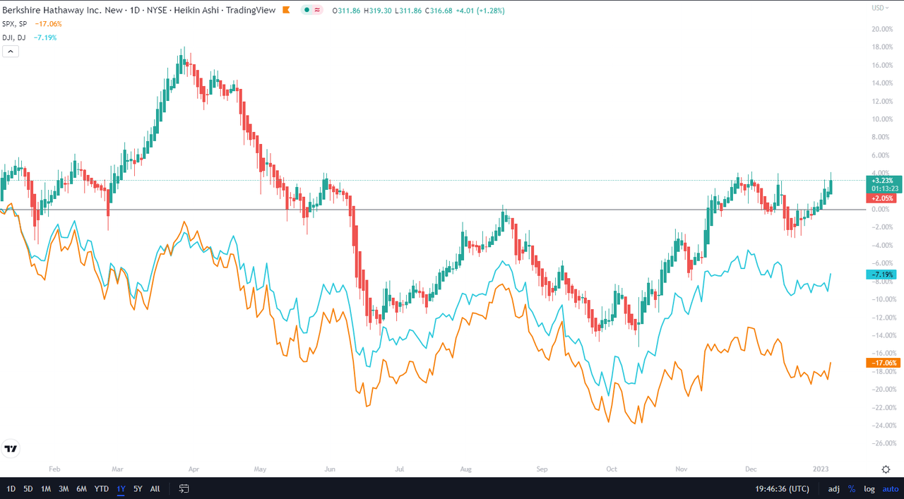
On the 3-month timescale, Dow Jones actually catches up with BRK 12.02% and 14.61%, respectively, while S&P 500 grew only a meager 3.88%.
3-month performance of Berkshire Hathaway and indices (TradingView)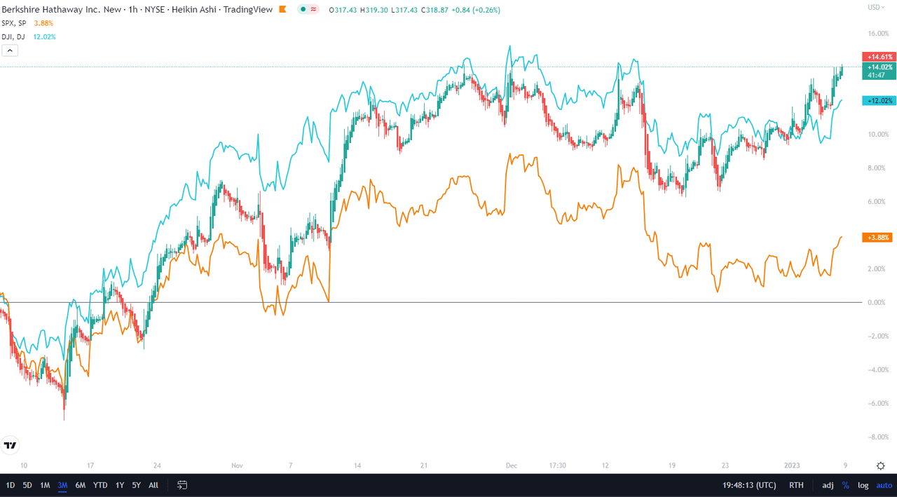
Explanation of My Technical Analysis Toolbox
I will analyze Berkshire Hathaway shares class B (which I own) from a perspective of a number of technical analysis tools and show the screenshots on the monthly, weekly, and daily Heikin Ashi candles charts – each timeframe presented through two separate sets of indicators – which I will complement with a simplified daily Renko chart.
The first chart setup (I will call it Chart 1) uses Bill William’s Alligator indicator and Awesome Oscillator, as well as Ichimoku Clouds and On Balance Volume indicator line. For fundamentals, I show the quarterly revenue trend, which I use for quick visual triage.
The Alligator technical analysis tool uses three smoothed moving averages that are based on thirteen, eight, and five periods, called also Jaw (blue line), Teeth (red line), and Lips (green line), respectively. Due to the smoothing of each moving average, the Jaw makes the slowest turns and the Lips make the fastest turns. The Lips crossing down through the other lines signals a short opportunity, while crossing upward signals a buying opportunity.
William’s Awesome Oscillator (AO) is a market momentum tool that visualizes a histogram of two moving averages, calculated on median prices of a recent number of periods compared to the momentum of a larger number of previous periods. If the AO histogram is crossing above the zero line, that’s indicative of bullish momentum. Conversely, when it crosses below zero, it may indicate bearish momentum.
As for the Ichimoku Cloud – I am not using a full set of lines of Ichimoku lines, only the Leading Spans A and B, whose crosses dictate the color of the cloud and whose individual lines provide levels of the strongest support and resistance lines. Ichimoku averages are plotted into the future, which in its own right provides a clearer picture but have no predictive powers.
On-Balance-Volume (OBV) indicator is a volume-based tool and is supposed to indicate the crowd sentiment about the price. OBV provides a running total of an asset’s trading volume and indicates whether this volume is flowing in or out, especially when viewed in divergence with the price action.
The second chart setting (Chart 2) uses 2 moving averages (10- and 50-period), volume, and volume’s 20-period average. On the screenshot from top to bottom, you will see the Composite Index Divergence Indicator (CIDI), which I learned from the book of Constance Brown, as well as J. Welles Wilder’s Directional Movement Indicator (DMI). I also use MACD (Moving Average Convergence Divergence) which is well known to everybody: I seek crossovers of MACD and signal, as well as above/below the zero level.
CIDI comes from a combination of RSI with the Momentum indicator. For more literature, see Brown’s paper or read her book. CIDI has been developed to solve the problem of RSI not being able to show divergence. I personally use the CIDI’s crossover above and below its slow and fast-moving averages, as well as the position of the averages against each other.
As for DMI, I skip the ADX line because it doesn’t give me anything. Instead, I focus on the crossovers of the Positive Direction Indicator DI+ and Negative Direction Indicator DI-. When the DI+ is above DI-, the current price momentum is upwards. When the DI- is above DI+, the current price momentum is downwards.
On the use of Heikin Ashi candles and Renko boxes, I use them as tools for trend reversal and continuation identification. Renko charts do not have a time scale, and they are built on price movements that must be big enough to create a new box or brick. Similar to Heikin Ashi, Renko charts filter the noise.
As you might have guessed, my focus is on identifying the trend reversal and filtering the noise that allows the position continuation without the risk of too many false signals. However, I will be honest with you – I am not showing here all the technical indicators that I use for screening and analysis, since they belong to my secret sauce.
The Long-Term Trend
For the long-term trend analysis, I use monthly charts. See below Chart 1, Berkshire Hathaway continues its green march, with the January candle painted in green as well, above the green Ichimoku Cloud. The Alligator’s lines are in positive set-up and Awesome Oscillator is in positive, although in lower readings than in December. OBV line has reached the highs from last April, but is slightly flattening.
Chart 1 – Monthly (TradingView)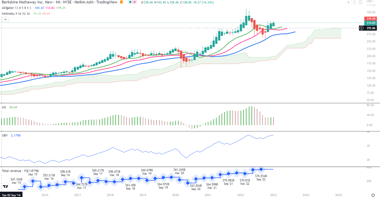
On Chart 2, there is a clear sign of the start of the new uptrend in the crossing of CIDI with the fast (green line) average from below. The fast average needs also to make a bottom U-turn to cross the slow average for the reinforcement of the signal. MACD will most probably soon cross its signal from below. DI+ has remained above DI- since August 2020 and played the role of the continuation indicator. The positions of the regular Moving Averages do not need any comment, but it is good to see that the current candle actually opened above the 10-month MA already.
Chart 2 – Monthly (TradingView)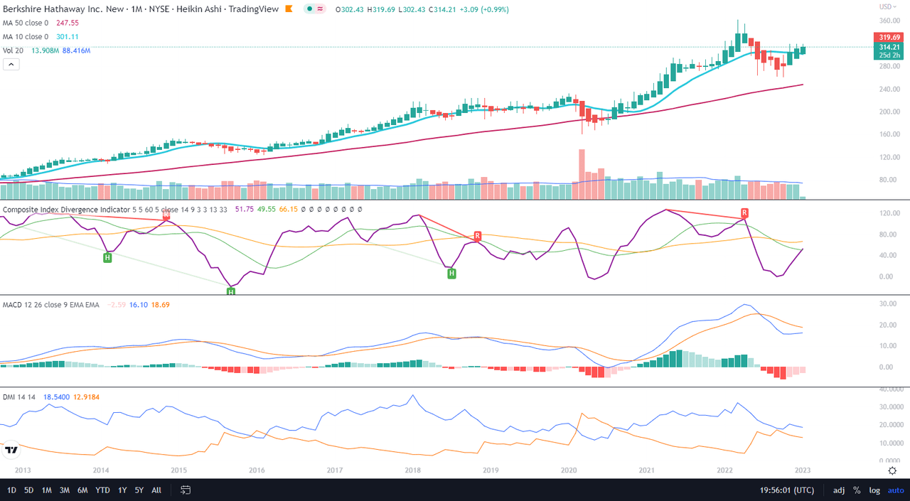
The Mid-Term Trend
As we can notice in Chart 1, the development of the momentum has been limited in the last weeks by the very strong resistance band around $313-320, which coincides with the upper edge of the red Cloud. Also, AO and OBV drop on this timeframe. The red Cloud area needs to narrow and bring the color change for the rally to begin. This picture invites cautiousness. You could say that the indicators on this chart are conservative.
Chart 1 – Weekly (TradingView)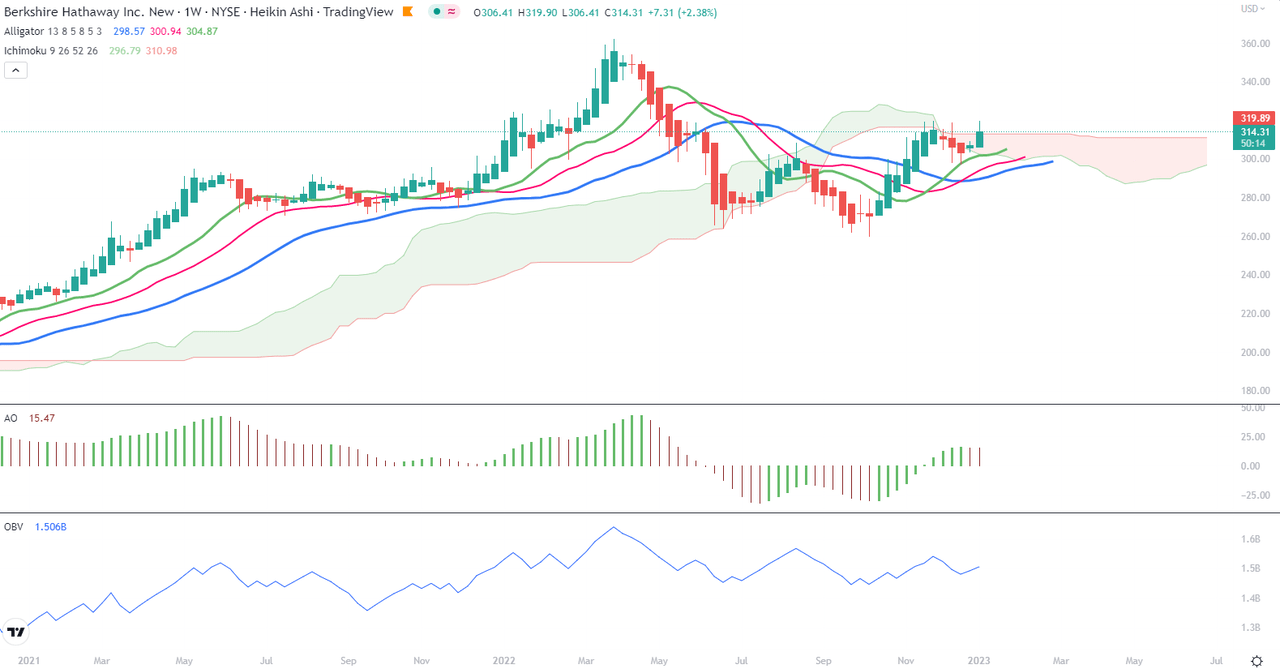
In Chart 2, we see more dynamics playing out. The 10-week MA has just crossed over the 50-week. CIDI has bounced off the slow average and is on the way to crossing over the fast average. Weekly MACD and its signal have just crossed above the zero line, another positive signal. Moreover, DI+ has bounced off the DI-. In other words, on this chart, all signals say “Go!”.
Chart 2 – Weekly (TradingView)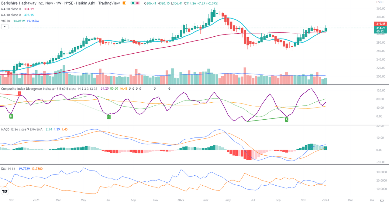
The Short-Term Trend
As we can see on Chart 1, the daily timeframe indicates the take-off is almost ready once the price bounces down from the resistance around $317-320 and once there is a short time correction to possibly $306-307. Given the thick green Cloud formed with the rising lower and upper edges, together with AO emerging over the zero line, this technical picture presages the breakout once the price crosses decidedly above the $320 resistance.
Chart 1 – Daily (TradingView)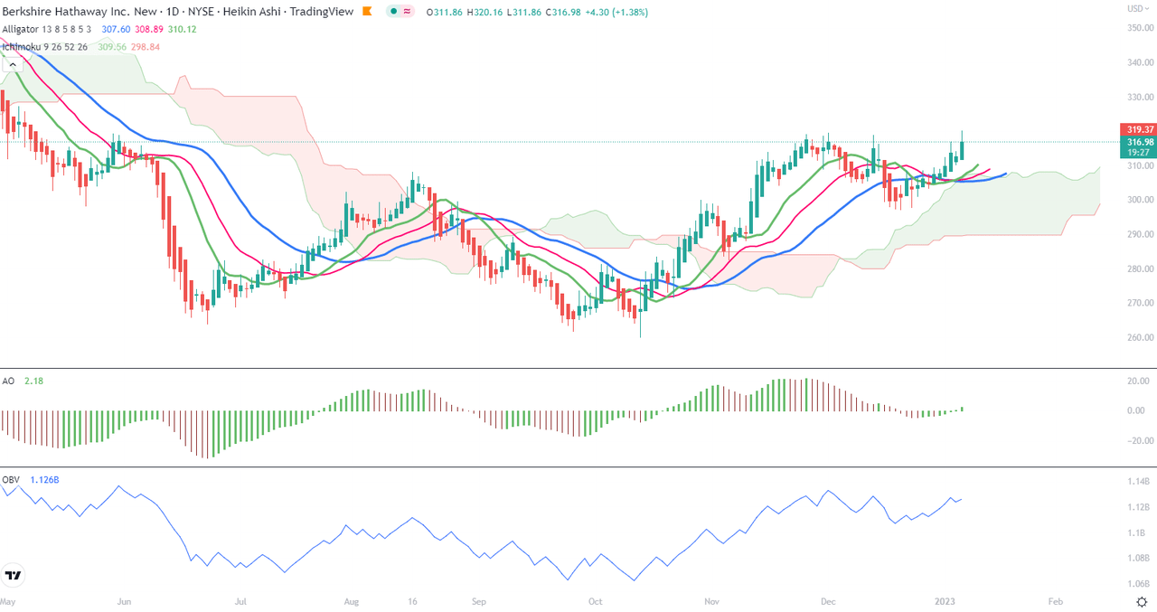
As for the picture on Chart 2, the technical indicators are as well giving green lights everywhere: 10-day MA bounced off the 50-day MA, both in upwards slope, CIDI fast average is crossing above the slow one, rising together with the CIDI line, MACD has just crossed the signal, and DI+ has widened sharply the distance above DI-. This chart actually would not even have us wait for an imminent correction. I am adding to my position on Monday. Just too late (a couple of minutes after 10PM CET on Friday) to buy tonight.
Chart 2 – Daily (TradingView)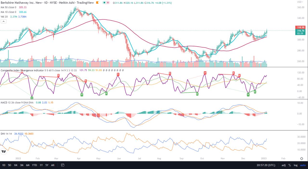
Price Momentum
The daily Renko chart presents the readiness of Berkshire Hathaway to take off. Its MACD and signal have just crossed above the zero line, similar to the rally kick-off from November 2020.
Renko Daily (TradingView)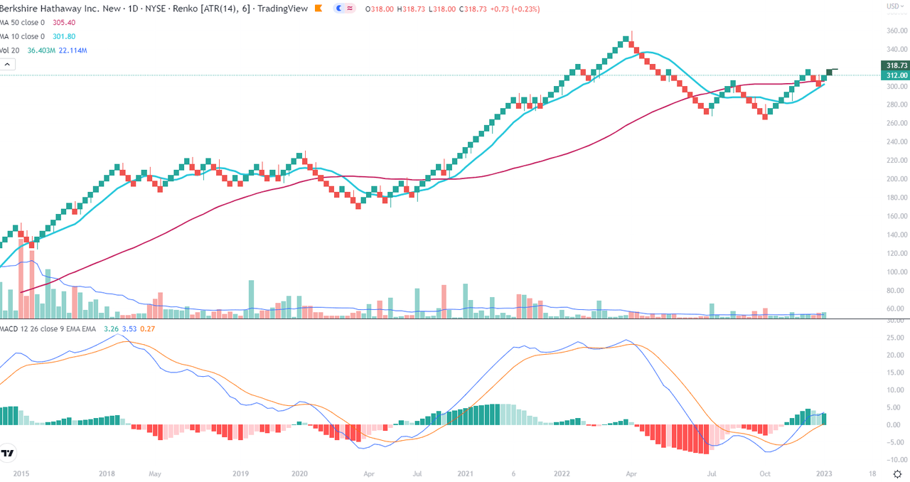
Conclusions
Technically, Berkshire Hathaway is entering rally time. I expect the beginning of the uptrend to start within the next 2-3 weeks, with a conservative margin for the resistance testing.
Be the first to comment